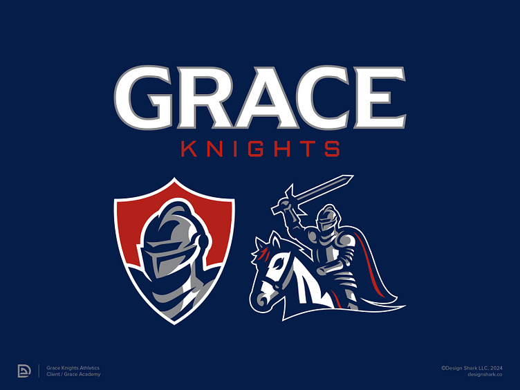
Grace Academy Knights | Branding
Grace Academy provides a winning athletic program built on faith and competitiveness that teaches its students how to succeed on the court and in life after school.
Identified Problem
Grace Academy currently doesn’t have an identity that properly represents their winning athletic program, minus a “GA” letter mark with “Knights” written underneath.
Approved Solution
Created an identity centered around a traditional medieval knight that bridges the gap between the athletic program and the academy. Created a cohesive identity that Grace Academy can own and use across multiple digital and print touch points. The knight logo system resembles a high-level and modern identity that feels fit for a school that has a winning and competitive pedigree.
Ready to give your brand the look and feel of a world-class organization?
Website | Instagram | Twitter(X) | LinkedIn


