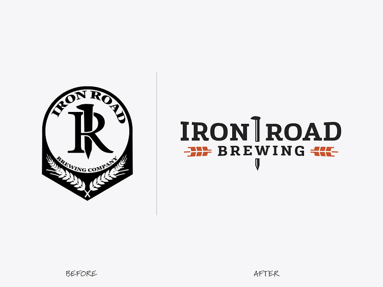
Rebranding – Iron Road Brewing
Rebranding can be a powerful way to bring new life into your brand, align with a new direction, or to reach a different audience.
In this case, Iron Road Brewing was finishing up their brewery, but had a logo that had some issues and needed a strong identity before they could open their doors.
As a brand-new brewery, creating an identity that was legible at a distance (building signage!) was a crucial part of building local brand recognition.
Although the railway spike through the ‘R’ was an element that they wanted to keep, they agreed that focusing on a strong logotype for the primary identity was the best approach. The 'IR' symbol would then serve as a secondary logo.
This version adds a bit more polish, and improves legibility while keeping the original intent intact.
Thinking about rebranding? Let's talk!


