Kyoob Architects - Website Wireframe
Kyoob Architects is an architecture company based in Singapore. Crafting meaningful spaces that inspire and connect, the brand needed a consolidation of its visual identity, brand strategy, and positioning. This was to reconcile its legacy of over 20 years of operation with its future goals of integrating sustainability, innovation, and inclusivity. We worked together to create a brand identity that reflects a commitment to user-centricity with an energetic edge.
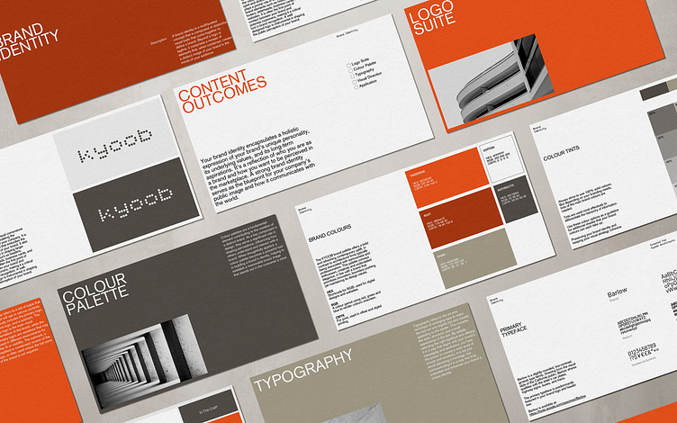
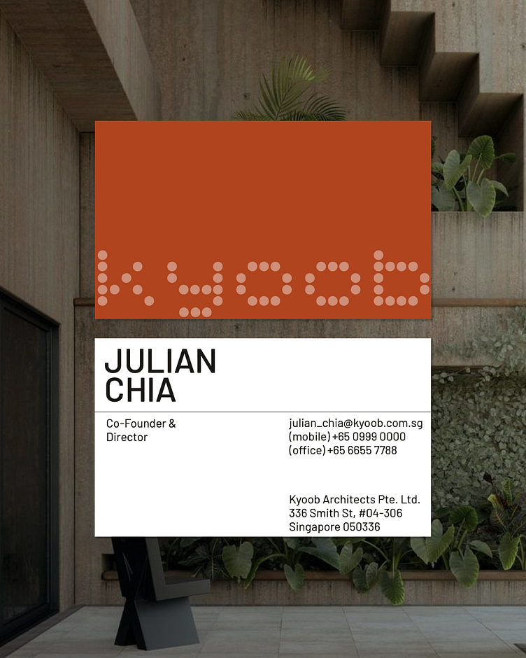
The Kyoob brand identity symbolises the hallmark of human-centric design, creating for the people, to better our lived environments and spaces. Simple shapes are used in the construction of the word ‘kyoob’ to symbolise the building blocks in architecture and urban planning. These shapes encapsulate the organic yet utilitarian quality of building materials and design.
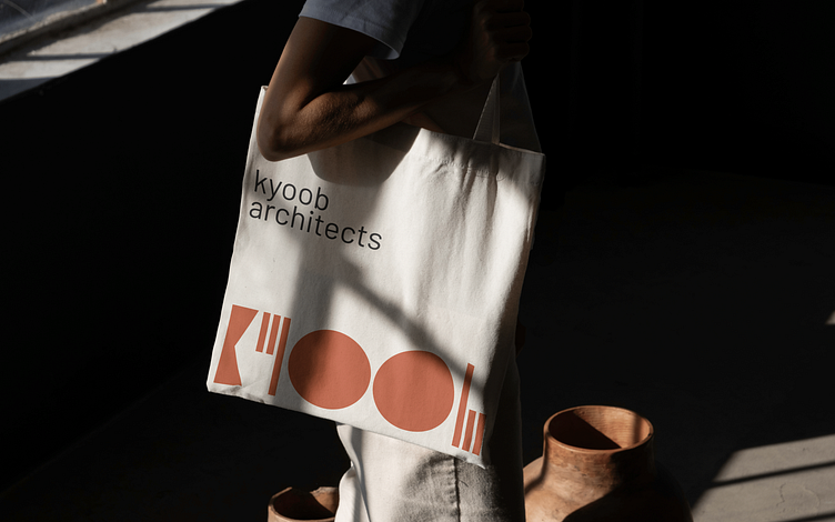
Shades of orange and red, inspired by terracotta and other similar building materials that the firm typically works with, are selected in addition to the brand’s pre-existing palette of browns and greys. The inclusion of these earthy tones creates a signature identity that reflects contemporary aspiration while paying homage to the foundational materials of their craft.
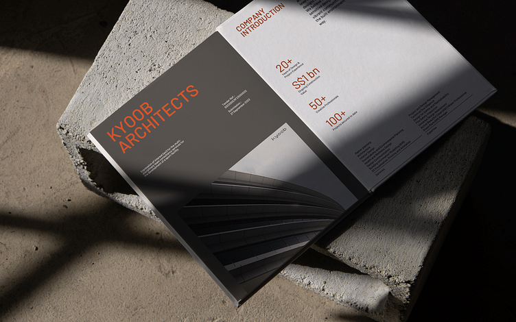
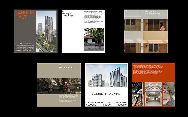
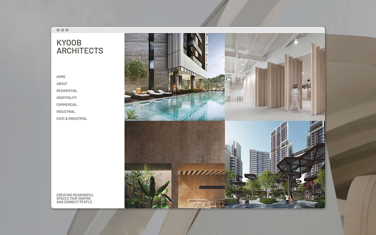
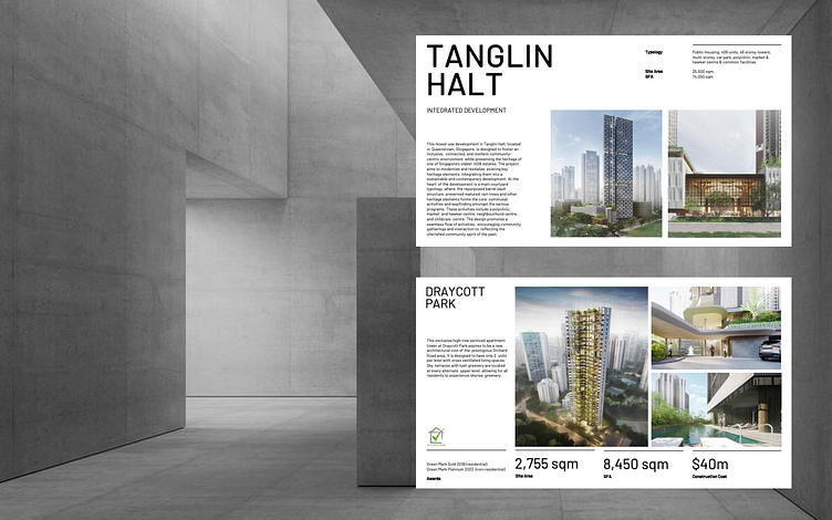
Owing to the image-heavy nature of the brand in showcasing portfolio projects and renderings, there was a need to create an intentional design layout that communicates information in a visuals-forward manner. The use of white space and grid-based layouts enable the organisation of information to tell impactful stories.
Our design approach often utilises a method of rethinking. Instead of reinventing the wheel to create an entirely new identity, it is sometimes worthy to look at the legacy behind the brand and see what is worthy to be revitalised, to combine heritage and innovation.
