That Company ⮕
Core Idea: Embracing the Vanilla
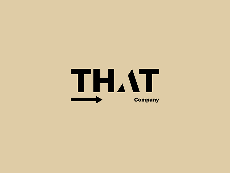
"That Company" and its venture, "That Space," are intentionally named to be versatile and open to interpretation. The logo design echoes this concept by being deliberately simple and unopinionated, much like the essence of vanilla itself - a flavour that complements, rather than dominates. It's a visual representation of a blank canvas, ready to be filled with the creativity and energy of the community it serves.
Logo Breakdown
Wordmark
The logo primarily features the company name in a clean, sans-serif typeface. This straightforward approach conveys a sense of honesty and transparency. The lack of embellishments or stylized elements further emphasizes the brand's neutrality, mirroring the subtle and adaptable nature of vanilla.
Fragmented "A"
The subtly fragmented "A" is a visual metaphor for the company's origins. It symbolizes the diverse backgrounds and experiences of the founders, who came together as individual pieces to create a larger, more meaningful whole. This element adds a layer of depth and storytelling to the otherwise minimalist design.
Arrow
The subtle arrow, cleverly integrated into the word "THAT", serves a dual purpose. It playfully emphasizes the brand name itself while pointing towards the adaptable subtext that can be tailored to the specific venture, such as "Company" or "Space". This dynamic element suggests direction and intention, hinting at the brand's ability to evolve and cater to various needs. It is purposely understated to ensure it doesn’t dominate the design, maintaining the logo’s overall unopinionated nature.
Colour Palette
The use of a neutral beige background with a black typeface reinforces the idea of the brand being as “vanilla” as possible. The color choice is non-distracting and serves to enhance the versatility of the logo across different applications.
Concept in Action
This minimalist logo design, with its "vanilla" essence, adaptable arrow, and symbolic "A," encapsulates the core values and origins of "That Company." It avoids any visual associations that might limit the types of events or activities hosted within its spaces. The logo's simplicity, akin to the familiar comfort of vanilla, makes it easily recognizable and memorable. The arrow's subtle dynamism and the fragmented "A" add layers of intrigue and storytelling, ensuring the brand remains relevant and engaging as it expands and evolves.
Standalone "A"
Distilled from the primary logo, the standalone "A" offers a concise brand mark for compact applications, maintaining recognition across various platforms. This version is particularly useful in various contexts where a compact and easily recognisable icon is needed.


