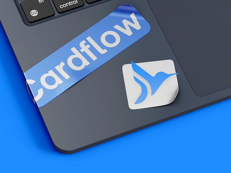
Logo and Brand identity design for FinTech company | Masterly
Our Approach
We conducted an in-depth interview with the founder, followed by comprehensive competitor research and an analysis of their preferred brands.
Additionally, we explored relevant references to ensure a well-rounded perspective.
To align our vision with the client’s expectations, we organized an observation session to discuss the research findings and establish a clear direction for the brand identity.
How we *ucked up?
Initially, we faced a challenge as our main design direction didn’t align with the client's expectations.
We were on different pages, BUT by collecting detailed feedback, we were able to pivot and reiterate the design, ultimately matching the client's vision and expectations 😎
Outcome
Cardflow now has a unique identity that the founders are thrilled with. The new branding significantly enhances their market presence and contributes positively to their brand recognition
Sketch Selection
We embraced the concept of the hummingbird, symbolizing agility and innovation. Four distinct sketch options were presented, each offering a unique interpretation of the hummingbird’s form.
The chosen sketch reflects the dynamic nature of the brand, serving as a foundation for the final logo design.
Logo Font Selection
We presented three font options — Ubuntu, Calibre, and Urbainst — to find the perfect match for Cardflow’s brand identity.
Each font was chosen for its modern, clean lines and legibility. The selected font, Ubuntu, was chosen for its friendly yet professional feel, perfectly aligning with Cardflow’s brand values of accessibility and innovation.
Color Selection
The color selection process was particularly challenging. Our initial idea was to draw inspiration from the vibrant colors of the hummingbird, aiming to capture its natural beauty in the brand’s palette.
However, the client did not resonate with this direction. Despite our enthusiasm for the concept, we had to pivot and explore alternative color schemes that aligned better with the client's vision, ensuring the final design met their expectations.
Final Selection
After exploring various color options, we arrived at a palette that perfectly aligns with the brand's identity. The final selection, featuring Penn Blue, Azure, White Smoke, and White, reflects a modern, trustworthy, and professional aesthetic.
These colors were well-received by the client, who appreciated the balance of boldness and simplicity, ensuring that Cardflow's brand is both memorable and visually appealing across all platforms.


