Paperspace - Desktop Mockup
In crafting the Paperspace brand identity, there was a need to blend facets of old and new, a challenge characteristic of SMEs in Singapore where pre-existing company traditions often collide with contemporary aspirations. We saw a thoughtful and strategic amalgamation as the way forward.
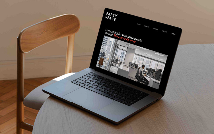
The choice of a bold ‘pop’ of colour was a deliberate undertaking to introduce colour and character to the design brand. Breathing life into the brand’s hitherto monochromatic palette was crucial in illustrating Paperspace’s shift toward greater creation, innovation and problem solving in the workplace.
Design is a constant exercise on creativity, its power lying in real problem solving. The choice of black as the background colour is indicative of increasing openness toward essentialising identity, creating content that cuts through the noise to showcase only what is important.
