Paperspace - Business Cards
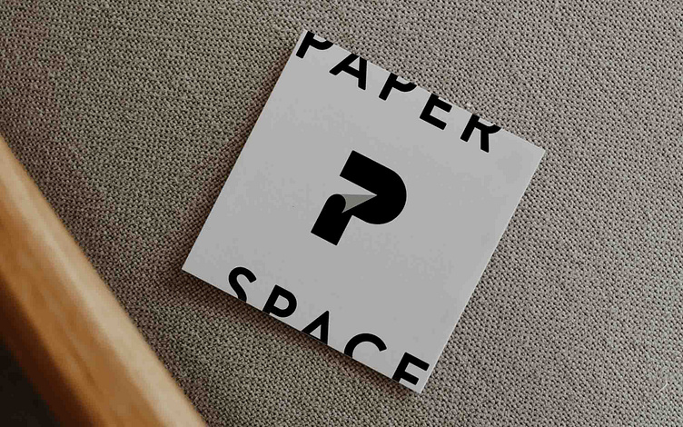
In customising a logo icon for Paperspace, we were thinking of a unique twist to the brand name. Showcasing the idea of paper folding down a page, this was subtly incorporated into the letter P, the brand's initial, creating a human-like quality to the brand and offering a memorable graphic that will stand the test of time.
The idea of deliberately cutting off the words 'paper' and 'space' was a creative choice that adds a depth of contemporaneity to the brand.
