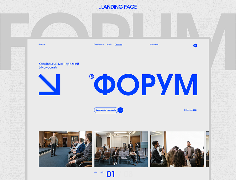
Website for the Kharkiv International Financial Forum
Block about the forum itself:
About design
..Task
It was necessary to develop a website with the following requirements: the site should look modern, concise, in the style of minimalism and without exaggeration, using the color blue on a light background.
..Solution
What did we get out of it? We got a website that demonstrates the main facts about the forum on 1 screen and on others as well. The site looks concise, without exaggeration in the style of minimalism, as we like. In addition, the content is built on a clean white background with accent blue.
My design ❣
If you want to see more of my works, follow the link - https://www.behance.net/5b622cf7
Let's cooperate. I give you my contacts 🤝
Outlook // gogerchak.igor@outlook.com
Email // ihorgog12@gmail.com
Telegram // - Ihor Hoherchak
Instagram - https://instagram.com/ihor.design?igshid=YTQwZjQ0NmI0OA==
WhatsApp // Ihor Hoherchak


