Change asset management website design
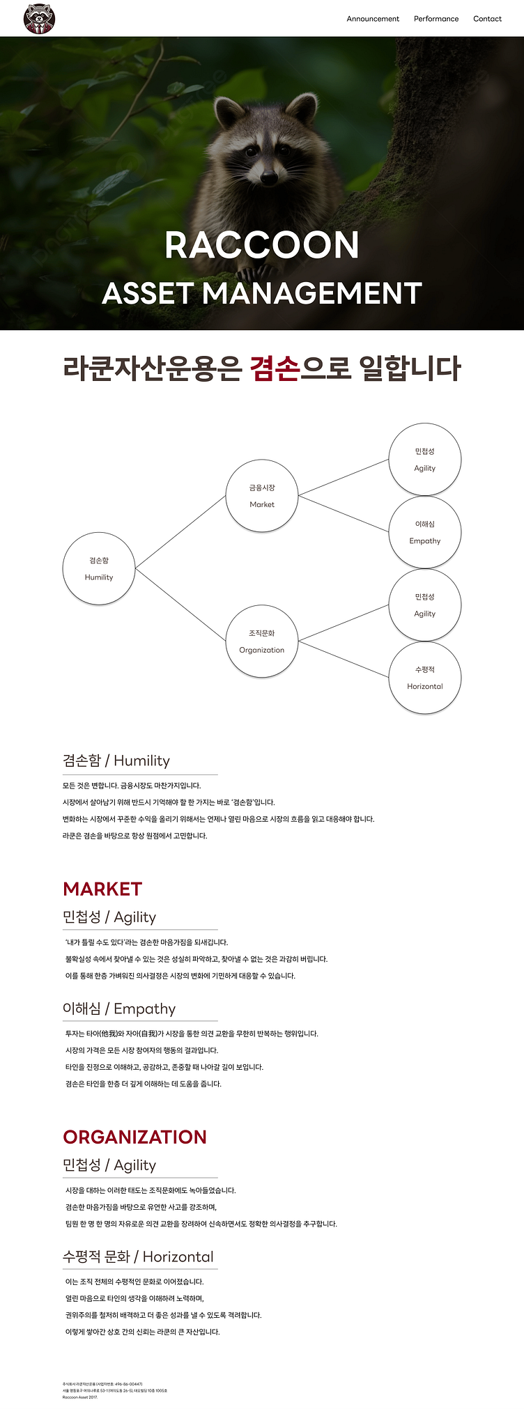
This picture above is my work.
Before, the website was look like this:
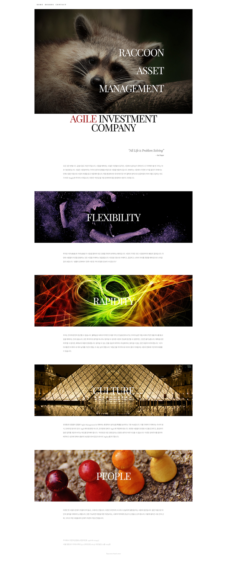
I found that this website has poor readability.
The text is too small,
and the headlines embedded within images, making them difficult to read.
Additionally, the headlines use keywords that do not align with the website's philosophy and sometimes appear duplicated.
---
So first, I emphasized their philosophy using large text.
I thought they would need new keywords matches with their philosophy, then I wrote them in mind map.
That chart says all the keywords come from their main philosophy, Humility.
Since this is an asset management website, I avoided using too many decorative images to maintain a professional appearance. Instead, I focused on expressing their philosophy and their professionalism clearly.
---
I used dark brown, burgundy, and white for the color scheme.
dark brown: #453833
burgundy: #900020
white: #ffffff
