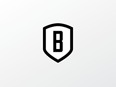
Rebranding Braeson
After quite a long period, I have decided to rebrand my personal image.
The design has several meanings captured in it that would not be immediately recognizable.
The name "Braeson" came about as an amalgamation of my two son's names, Mason and Braeden. The shield represents our strength together. The curve at the top represents a rising sun - new beginnings. I have recently gone through some changes in my life and this is a new chapter for myself - The B is simplicity in my life now. The base of the shield has three points, a triangle of sorts. The top two points being my kids and the base point being myself. My boys, above myself, pointing the way to that rising sun and our new beginning.
It feels good to finally, after almost a year, have something that means so much to myself.
