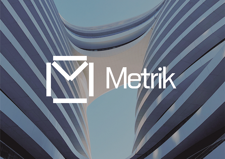
Metrik
Project Overview
Metrik is an architecture studio known for its commitment to clean, sustainable design practices. Their work emphasizes creating sleek, functional spaces that foster productivity and comfort. These spaces are designed to align with the modern businesses they serve, transforming environments into places where success is fostered. The studio’s ethos is rooted in precision, balance, and functionality—principles they aim to communicate visually through their branding.
Metrik needed a visual identity that would embody the elegance and precision of their design work. The challenge was to create a logo that not only reflects the architecture firm's commitment to modernity and functionality but also ties in the behind-the-scenes processes that shape their designs. The logo had to communicate the firm’s emphasis on symmetry, clarity, and the balance between form and function—all while conveying the cutting-edge and technical nature of the architectural field.
Logo That Speaks Architecture
The logomark is a unique and subtle reference to architecture. It incorporates:
Angles that evoke the structural foundations of architecture.
Measuring tape symbolizing precision and the technical aspects of design.
Tech Specs to highlight the behind-the-scenes work in every project.
Building Symbol to directly tie the logo to the core of what Metrik does—create functional, aesthetic spaces.
Letter M integrated into the logomark as a direct reference to the firm's name, while emphasizing symmetry and balance.
The overall design of the logo balances these elements to create a cohesive, modern identity that reflects Metrik’s expertise in both form and function. The logomark is minimal yet rich with meaning, communicating Metrik's focus on precision and symmetry in their architectural projects.
Typography That Defines Modernity
A clean and modern sans serif font was chosen to reflect the firm’s contemporary approach. This modern typeface aligns with Metrik's ethos of simplicity, clarity, and efficiency, mirroring their design philosophy.
Outcome
The Metrik branding solution offers a sophisticated, modern identity that visually represents the firm's values. The logo’s geometric structure and subtle references to technical elements and architectural symbols create an immediate connection to the firm’s design philosophy. This identity is not just a logo; it is a representation of Metrik’s commitment to clean, sustainable design and their ability to create spaces where both form and function are in perfect harmony.
This new identity helps Metrik stand out in the competitive world of architecture by establishing a strong, memorable brand that resonates with clients seeking precision, innovation, and a modern approach to design.


