PlanFam
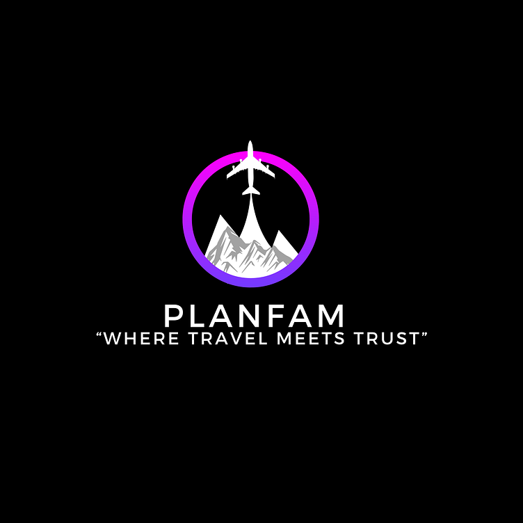
I designed this logo for PlanFam Trips, a platform dedicated to connecting travel agents with hosts for familiarization (fam) trips. The design incorporates travel and networking elements to symbolize trust, connection, and innovation in the travel industry.
Design Elements:
Symbolic Representation:
Airplane and Mountains: The central motif features an airplane soaring above mountains, indicating a focus on travel and exploration.
Gradient Circle: The vibrant gradient circle represents unity, seamless connections, and the dynamic nature of the travel industry.
Color Palette:
Purple to Pink Gradient: The gradient symbolizes creativity, innovation, and vibrant travel experiences.
Blue Text: Used for the brand name and slogan, blue conveys trust, professionalism, and reliability.
Typography:
PlanFam: Displayed in a bold, modern font in blue to ensure strong brand presence and easy recognition.
Slogan: "Where Travel Meets Trust" is written in a sleek, clean font in blue, reinforcing the platform's commitment to fostering trust and transparency in travel partnerships.
If you like my work and would like to discuss potential opportunities, feel free to contact me at:
Phone: +251944440793
Telegram: @Zain_MK
Email: zabdunasir@gmail.com
