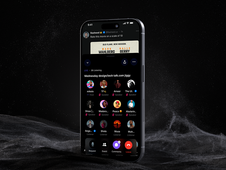
X (Formerly twitter) Space
Yesterday, I was scrolling through my feed when I noticed an ongoing X Space. Curious, I decided to join. After spending some time in the Space, I needed to leave and continue with my activities.
However, I found it challenging to access the leave button as it was positioned far up on the right, making it difficult to reach with my left thumb.
I observed that placing the end call or exit button at the top, can be frustrating. This inspired me to create the screen below the next day to address this usability issue.
What do you think? Let me know in the comments!
I hope you enjoy this design. Press "L" if you like it! 🔥🔥🔥
Available for design gigs: rasheed.ux@gmail.com | Check out my portfolio.
Thank you for viewing!
More by Abdur-rashid Idris View profile
Like

