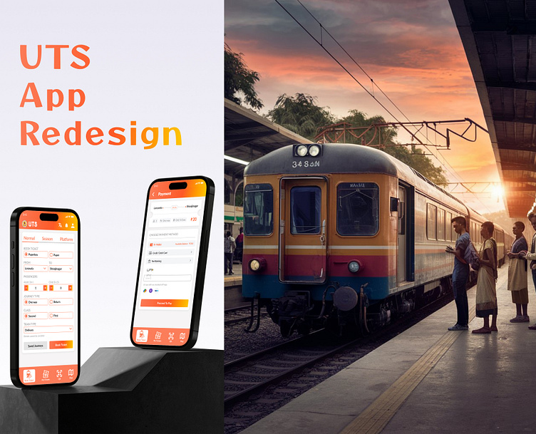
UTS App Redesign
🚀 𝗗𝗮𝘆 𝟴 𝗼𝗳 𝗠𝘆 𝟯𝟬-𝗗𝗮𝘆 𝗨𝗜 𝗗𝗲𝘀𝗶𝗴𝗻 𝗖𝗵𝗮𝗹𝗹𝗲𝗻𝗴𝗲: 𝗥𝗲𝗱𝗲𝘀𝗶𝗴𝗻𝗲𝗱 𝗨𝗧𝗦 𝗧𝗿𝗮𝗶𝗻 𝗧𝗶𝗰𝗸𝗲𝘁 𝗕𝗼𝗼𝗸𝗶𝗻𝗴 𝗔𝗽𝗽! 🚆
When I took on the challenge of redesigning the UTS train ticket booking app, I noticed that the older version struggled with a cluttered UI. Crucial features were buried, and users found themselves navigating through a maze of confusion.
🔍 𝗣𝗿𝗼𝗯𝗹𝗲𝗺 𝗦𝘁𝗮𝘁𝗲𝗺𝗲𝗻𝘁: The previous app interface was overwhelmed with unnecessary elements, lacking intuitive navigation, and missing key functionalities. Users found it challenging to complete their ticket bookings efficiently.
💡 𝗦𝗼𝗹𝘂𝘁𝗶𝗼𝗻: In the redesign, my primary goal was to create a user-centric UI that’s both intuitive and aesthetically pleasing. I streamlined the navigation, ensuring that essential features are easily accessible and clearly visible. By enhancing the visual appeal and user flow, I aimed to reduce friction and improve overall user satisfaction.
🔧 𝗔 𝗡𝗲𝘄 𝗧𝗼𝗼𝗹 𝗨𝘀𝗲𝗱: For the first time, I utilized Ideogram for image generation in this project. Ideogram’s ability to generate high-quality visuals based on detailed prompts significantly enhanced the visual design process. This tool proves to be a game-changer when you know how to harness its potential with precise prompting.
Feel free to check out the revamped app and let me know your thoughts!
#UIDesign #UXDesign #AppRedesign #Ideogram #UserExperience #DesignThinking #Innovation #TechForGood #UTSredesign


