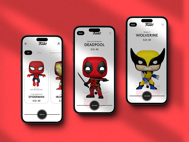
Funko App - Deadpool & Wolverine
Here is a minimalist redesign of three key screens in the Funko app, featuring Deadpool and Wolverine collectibles. Here's what I focused on:
Clean Interface: Removed clutter, emphasizing product images and core info
Bold Typography: Improved readability with clear, sans-serif fonts
Simplified Color Scheme: Used black and white to make character designs pop
Streamlined Navigation: Added prominent CTAs for easier purchasing
Why Minimalism for These Screens?
Highlights products
Creates a modern look
Simplifies user decisions
This approach showcases how targeted design changes can enhance the e-commerce experience, even on a limited scale.
What's your take on minimalist design for collectible showcases? How would you balance simplicity with brand personality?


