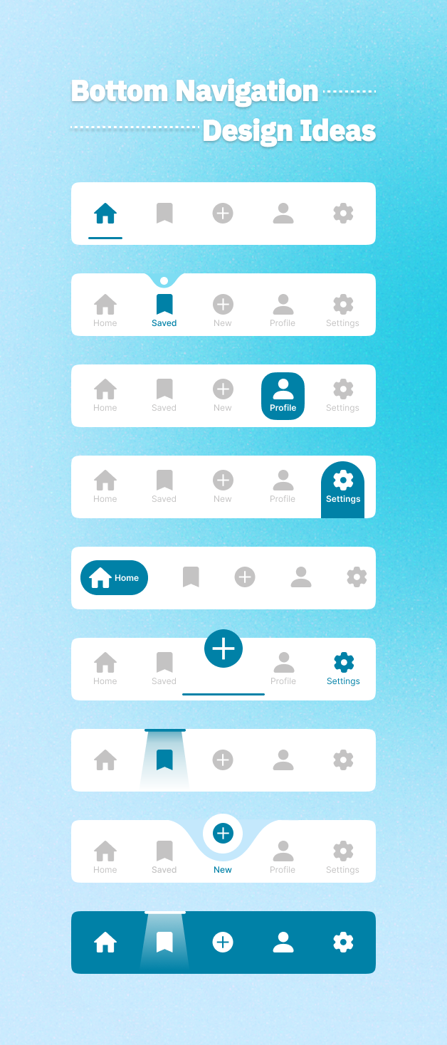
Bottom Navigation Design Ideas
🚀 𝗗𝗮𝘆 𝟳 𝗼𝗳 𝗠𝘆 𝟯𝟬-𝗗𝗮𝘆 𝗨𝗜 𝗗𝗲𝘀𝗶𝗴𝗻 𝗖𝗵𝗮𝗹𝗹𝗲𝗻𝗴𝗲: 𝗘𝘅𝗽𝗹𝗼𝗿𝗶𝗻𝗴 𝗕𝗼𝘁𝘁𝗼𝗺 𝗡𝗮𝘃𝗶𝗴𝗮𝘁𝗶𝗼𝗻 𝗗𝗲𝘀𝗶𝗴𝗻𝘀! 🎨
Today, I delved into the concept of Bottom Navigation Designs, a crucial element in modern mobile interfaces. My objective was to explore various styles and methods to improve usability while injecting a dose of creativity.
Each design iteration was a step toward mastering the balance between aesthetics and functionality. I am eager to witness the evolution of these concepts as I continue with this challenge.
💬 I would greatly appreciate hearing your thoughts. What’s your go-to style for bottom navigation? Do you have any tips or feedback on these designs?
#UIDesign #UXDesign #DesignChallenge #BottomNavigation #MobileUI #DailyUI #DesignInspiration #UserExperience #30DayUIChallenge #LinkedInLearning
