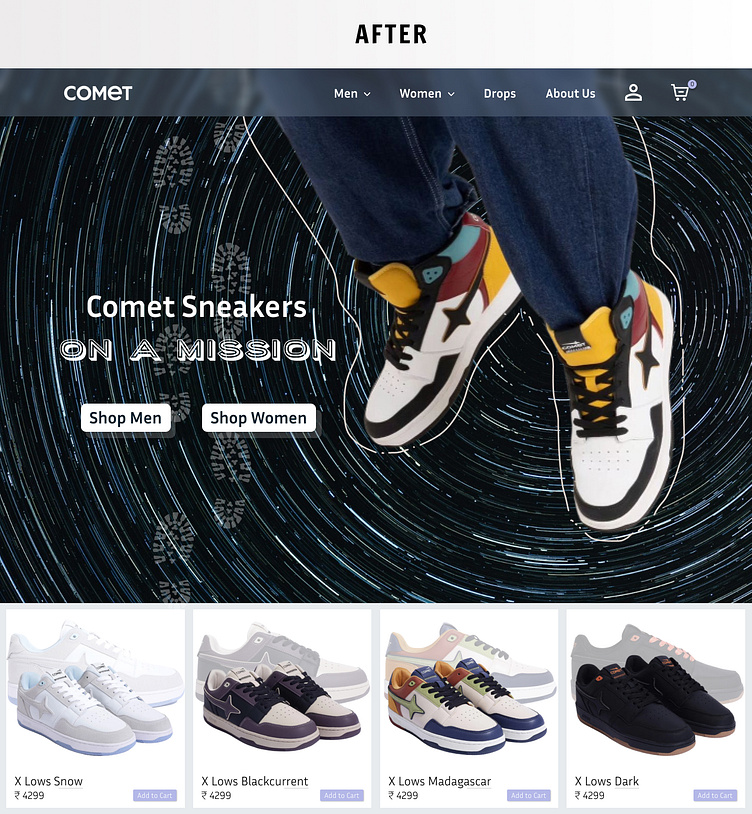
Comet Landing Page Redesign
For the next 30 days, I’ll be pushing my creative limits by taking on a series of design projects.
🚀 𝗗𝗮𝘆 𝟭 𝗼𝗳 𝗺𝘆 𝟯𝟬-𝗗𝗮𝘆 𝗨𝗜 𝗗𝗲𝘀𝗶𝗴𝗻 𝗖𝗵𝗮𝗹𝗹𝗲𝗻𝗴𝗲!
Today, I took on the challenge of redesigning the landing page for 𝗖𝗼𝗺𝗲𝘁, a dynamic and stylish shoe brand. 👟✨
Here’s what I aimed to achieve with this redesign:
• 𝗖𝗿𝗲𝗮𝘁𝗶𝘃𝗲 𝗩𝗶𝘀𝘂𝗮𝗹𝘀: I stepped outside the box to craft a fresh, modern aesthetic that I believe enhances the original design, making it more dynamic and visually appealing.
• 𝗕𝗼𝗹𝗱 𝗣𝗿𝗼𝗱𝘂𝗰𝘁 𝗦𝗵𝗼𝘄𝗰𝗮𝘀𝗲: With high-quality images and striking typography, I aimed to put the products in the spotlight, ensuring they’re the stars of the page.
• 𝗨𝘀𝗲𝗿-𝗖𝗲𝗻𝘁𝗿𝗶𝗰 𝗘𝘅𝗽𝗲𝗿𝗶𝗲𝗻𝗰𝗲: A streamlined layout and intuitive navigation were key priorities, making the shopping journey smoother and more enjoyable.
I’d love to hear your thoughts on this creative redesign! How do you think it compares to the original? Any feedback or suggestions would be greatly appreciated as I continue to learn and grow through this challenge.
#UIDesign #CreativeDesign #WebRedesign #Ecommerce #DesignChallenge #UXDesign #ShoeDesign #Feedbackappreciated #LearningByDoing

