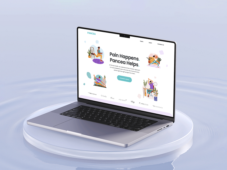
PANCEA [ Landing Page ]
How does better care look? 💞
Welcome to Pancea, your go-to healthcare app specializing in musculoskeletal care. Our landing page is designed with you in mind, providing a seamless and stress-free experience. With a focus on clarity and simplicity, Pancea's design ensures that accessing personalized care has never been easier. We believe that healthcare should not only be effective but also approachable and calming, and our design reflects that philosophy.
Pancea's visual identity is built on light pastel colors and minimalistic illustrations that create a serene atmosphere. Our design features a harmonious palette of pastel purple, orange, green, red, blue, and turquoise, strategically placed to highlight key elements and guide users intuitively through the interface. The white background offers a clean, uncluttered space that enhances readability, while dark blue text provides clear contrast and accessibility.
We've chosen the Poppins font for both headers and body text to maintain a modern, clean aesthetic. Poppins Semibold for headers ensures key sections stand out, while Poppins Regular for body text offers a comfortable and legible reading experience.
With care, Triangle 💞
Let's get started on your project today! Drop us a line: hello@3angle.pro
We also encourage everyone to support Ukraine💛💙 with links below or any way you can!


