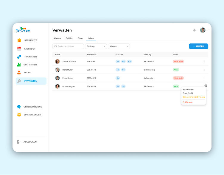
Manage Users Screen
Design of Manage Users screen for Emoree platform.
The Manage Users screen has tabs to make it easier for the users to manage classes, pupils, parents, and teachers. Tabs are later followed by a filter section by which, from the table, a teacher can get detail in a specified manner. A table is displayed for essential data that include teacher IDs, classes assigned, positions, and statuses. There, in addition, more options can be accessed by clicking the 3-dot icon next to each entry, opening a popup menu with options to Edit, View profile, Deactivate user, or Delete. The color scheme has been strategic and is available in red, green, and blue, differentiating between modes and class category.
When clicked, the + Teacher button gives a pop-up form (image below) in which users are able to input their details, for example, their email, class, position, and Emoree ambassador status.

