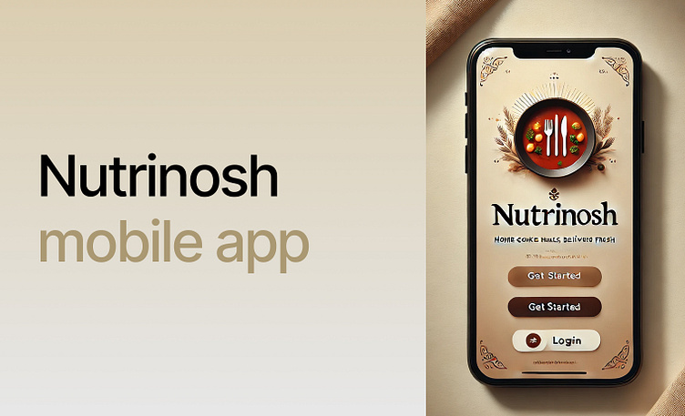
UX Case Study (made with AI): NutriNosh-mobile application
Nutrinosh is a food app designed for busy, on-the-go millennials living away from home, providing them with a platform to connect with local families and enjoy healthy, home-cooked meals. Nutrinosh not only offers the younger generation access to nutritious, homemade food but also empowers home cooks to turn their passion into a thriving business opportunity.
Problem Statement: In today’s fast-paced world, individuals often find themselves living far from home due to work or educational pursuits, facing the challenge of sourcing nutritious meals that align with their dietary needs and preferences. This distance exacerbates the difficulty of finding food prepared with specific ingredients, especially for those with allergies or dietary restrictions. Moreover, the lack of access to homemade meals deprives individuals of the comfort and nourishment associated with home-cooked food.
NutriNosh — the proposed solution: Recognizing the above challenges, there is a pressing need for a mobile application that bridges the gap between individuals living away from home and local home cooks willing to provide homemade meals tailored to their dietary requirements. This app not only addresses the nutritional needs of users but also offers a sustainable income-generating opportunity for home cooks, fostering a mutually beneficial ecosystem. By facilitating the connection between consumers and home cooks, this application aims to enhance the well-being and culinary experience of individuals living away from home.
User research : I surveyed by floating a google form with a certain set of questions to conduct user research and below is the result of the questions asked and the challenges faced by the users.
Empathy Mapping
Whimsical flow diagram
What’s next: I am working on wireframe generation with the help of AI plugins and will explore the Figma AI for creating the low-mid fidelty designs once live.
Your feedback is highly appreciated!


