27/32 – Dallas Talons
Take Hold
The Dallas Talons are team number 27 for the project, playing in the Central Division in the East Conference.
Another one of the original UFL franchises, the Talons are one of the true competitive pillars of the East. The reign as "top-of-the-food-chain" stretches from seasons 9 and 11 – where they won 2 UFL Championships in three seasons – to present day with East Conference championship appearances in 25 and 27, ultimately falling to New York in both instances. In an increasingly competitive Central Division, Dallas may be forced to fight to stay on top.

Visual Direction
Candidly, this franchise was originally named for the alliteration between the location and nickname and the symmetry that it allowed in the design. However, with the visual focus of a bald eagle in the identity, a link can be made to the fight for independence in the Texas Revolution and the and eventual admittance to the Union, as the bald eagle is a symbol of freedom.
The Talons were originally a team with a silver, black, and old gold color scheme until eventually moving towards a more patriotic look just before their championship run, substituting the latter two colors for navy and royal blue.
Execution
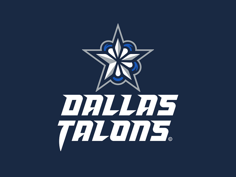
The primary logo for the Talons is the signature five-pointed Texas star with white and silver beveling gripped by the talons of an inferred bald eagle.
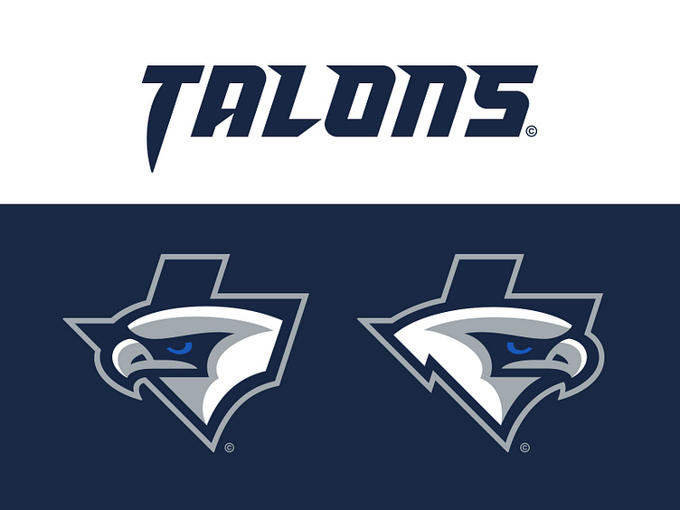
Dallas has a secondary logo that depicts the silhouette of Texas containing a left-facing bald eagle with a royal blue eye. The bird's beak makes up the southern portion of West Texas. There is a variant of this logo where the eagle is facing right, with the beak making up the larger portion of East Texas.
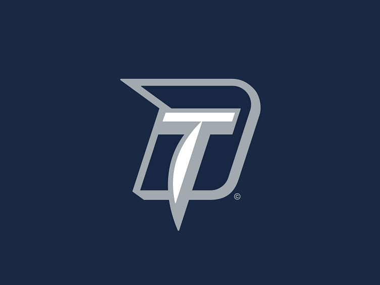
The tertiary mark for the Talons is used exclusively on sideline apparel and merchandising, featuring a "D" in navy with a "T" for Talons making up the inner counter of the former. The "T" is shaped like a talon and incorporates the same white and silver beveling as the star in the primary.
This team uses a single typographic treatment across its location and team name wordmarks. At its core, it's a square unicase sans with an 18-degree italic angle that integrates spur serifs and chamfered angles that mirror the 5-pointed star in the primary. The "T" in the "Talons" wordmark drops an additional 50% further below the baseline and demonstrates a sharp talon-like appearance.
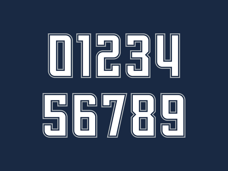
Dallas' jersey number set borrows some traits from the wordmarks (namely the typographic style save for the angle and additional adornments) but in a more condensed footprint. It incorporates a visual rhythm of the northeast and southwest corners of each letterform are rounded-off while the northwest and southeast corners are squared. This creates a series of hooks and points that allude to subtle talon-like characteristics.
Apex Predators
The Dallas Talons look to take hold of the East Conference once again with a refreshed identity and sharp graphic package, fighting off the rising competition in a tough division.
Football Helmet Mockup by SportsTemplates
____________________