Rating a whisky, mobile app
Whiskey App Design 🥃
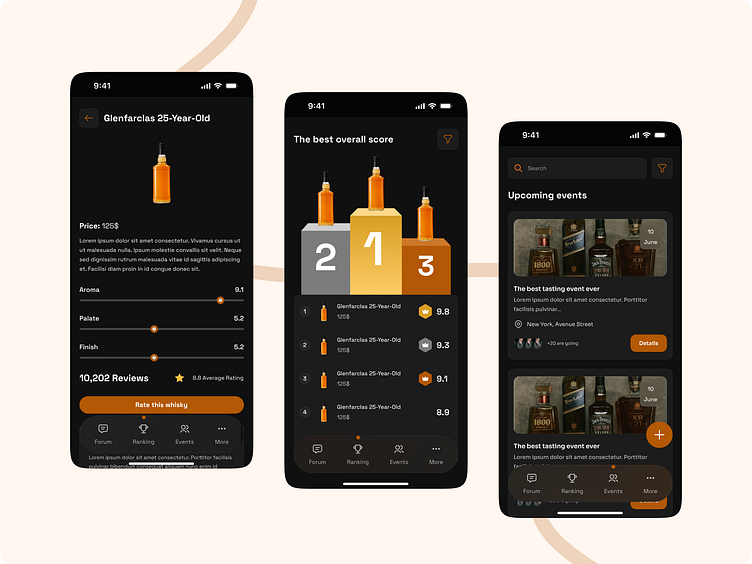
Hey everyone! I’m excited to share this whiskey app design I’ve been working on. I chose these warm, rich colors because they remind me of whiskey itself and give the app a sophisticated, masculine feel.
Here’s what I’ve included:
Whiskey Details: Each whiskey gets its own profile with ratings for aroma, palate, and finish. I wanted to make it easy for people to quickly see what’s what.
Top-Rated Whiskeys: There’s a ranking system that highlights the best-rated options, helping users find their next favorite drink.
Events Section: I’ve also added a section for upcoming whiskey tastings, so you can always know when and where the next event is happening.
The design leans into a dark mode look, which I think really complements the warm tones of whiskey.
Would love to hear what you all think about this one!
🛠 Design tools - Figma
❤️ Press "L" if you like it.
✉️ Have a project idea? Say hello!

