Car Park App Redesign
Another visual redesign exercise, this time for a parking app PayByPhone. Focused on the main home screen and the map view.
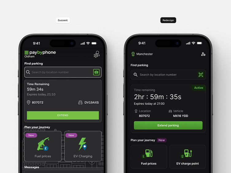
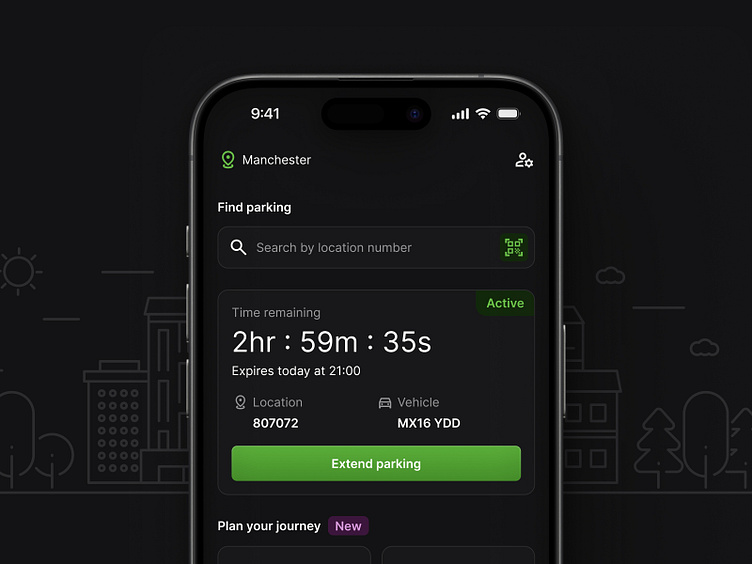
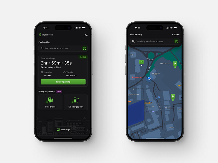
I decided to drop the logo, as you already encounter it on the splash screen during the app's initial load, so displaying it repeatedly on every screen is unnecessary.
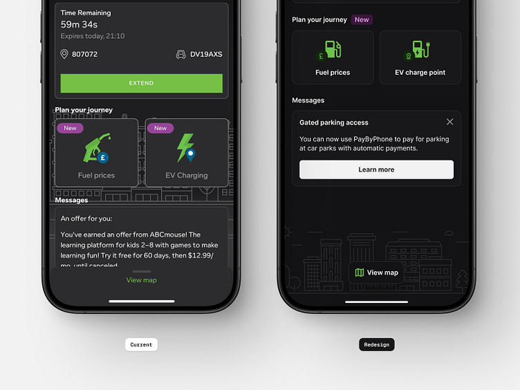
I updated the surface grey colours throughout the design to be darker, making the screen feel less busy and bringing focus to the content with contrasting type and brand colour accents on supporting icons.
Reduced the size of the illustration in the background to minimise visual clutter within the main screen - adding focus to the components above.
Floating button: To access the map I used a floating button which will occupy significantly less portion of the screen compare to a full-width sheet component. This creates a clearer and more streamlined view.
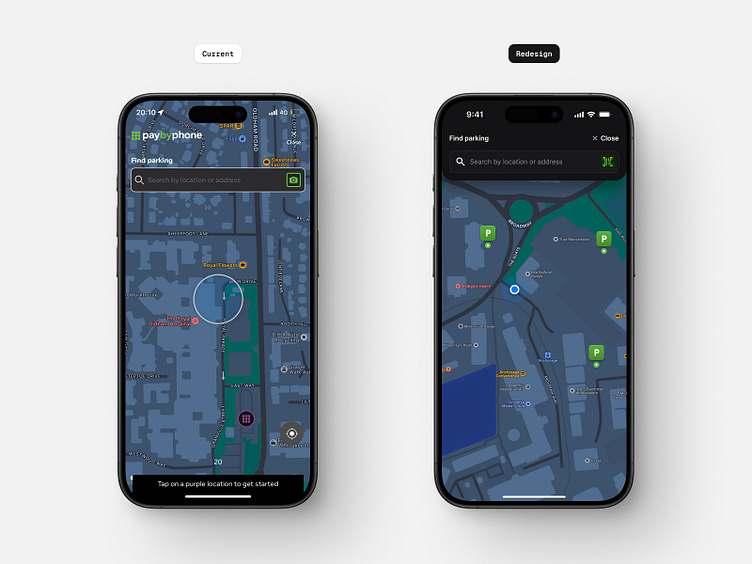
Page header: Added a solid background colour to create a consistent contrast, ensuring that the elements in the header remain clear and accessible to the user.
Location icon: A different style for the parking location icon to make them more distinguishable from other icons and labels within the map, helping users quickly identify parking locations.
Let me know your thoughts. Thanks.
Disclaimer: Redesign Work for Practice Purposes Only
This redesign project is solely for practice purposes. Any concepts, designs, or materials produced during this exercise are not intended for commercial use. The aim is to enhance skills, explore techniques, and develop proficiency only. No affiliation with any specific brand, company, or organisation is implied. All rights to any original content used or referenced in this project belong to their respective owners.
