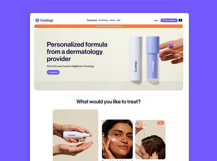
Cosmetic brand landing page
Curology is a cosmetics brand that provides personalized prescriptions for issues like acne and hair loss. I enjoyed designing a new landing page for them because I felt like their current one was a bit too traditional. I wanted to showcase Curology's strengths, such as their team of committed dermatologists, their active ingredients, and real product feedback featuring impressive before and after results.
I set out to revamp the landing page to better showcase Curology's unique strengths, focusing on personalized skincare for acne and hair loss. In the 4 hours, I achieved the following:
1. Emphasized Curology's brand promise of personalized skincare prescribed by dermatologists to meet individual needs.
2. Simplified navigation by organizing products into three main categories: acne, anti-aging, and hair care for easier navigation.
3. Highlighted customer testimonials and before-and-after photos to build trust.
4. Emphasized active ingredients to demonstrate the quality and effectiveness of the products.
5. Integrated reassurance elements such as guarantees and certifications to strengthen user trust.
6. Created cross-selling options like essential kits and starter kits to guide customers in their skincare routines.
7. Redesigned the footer to make it more engaging and visually appealing, encouraging users to join the Curology community.
Visuels Unsplash
©Curology


