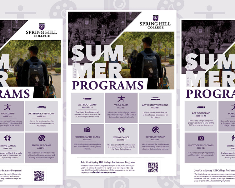
SHC Summer Programs Flyer
Overview
This case study highlights the design process for creating promotional content for a series of summer camps and sessions. The focus was on ensuring that the marketing efforts appealed to both alumni and local communities, while also generating interest in specific camps that required a higher number of participants, such as the ACT Bootcamp.
____________
Design Strategy
Target Audience:
Primary: Local community members and alumni who are looking for engaging activities on The Hill this summer.
Secondary: Older teenagers (for specific camps like the ACT Bootcamp).
Visual Consistency Across Materials:
All promotional assets used a cohesive color palette, fonts, and design elements that align with the organization’s branding.
The flyer and social media visuals were designed to be easily recognizable and appealing across platforms.
Flyer Design:
The flyer was designed with a focus on clarity and visual hierarchy. Each camp was listed with a brief description, accompanied by icons that represent the type of activity (e.g., academic, creative, wellness).
Visual graphic layout of images collect into a collage creating a square lockup outline in the form of "24" for the Summer of 2024 programs listing entry.
The QR code was prominently displayed, leading directly to the dedicated summer programs webpage.
Key details, such as dates and target age groups were clearly presented.
Challenges
Registration Details: The ongoing work to finalize payment and registration details meant that promotional materials needed flexibility. The design accounted for this by allowing easy updates to content as details were confirmed.
Balancing Broad and Niche Appeal: While the overarching flyer needed to cover all six programs, the video and social media content had to focus on the pricier, specialized camps. Striking this balance was key in the design approach.
Outcome: The promotional campaign successfully generated interest and early registrations, particularly for the ACT Bootcamp, which met its minimum attendee goal. The cohesive visual identity across platforms ensured that the materials resonated with both the local audience and alumni, creating a sense of community involvement in the summer programs.
Next Event Steps: The client is now considering expanding this approach to future seasonal programs, incorporating even more multimedia content to drive engagement. Additionally, they plan to use analytics from this campaign to refine their targeting strategies for future email and social media pushes.
Conclusion
This project highlights the importance of a comprehensive design strategy when promoting multiple programs with different target audiences. By focusing on visual consistency, audience segmentation, and tailored content, we successfully met the client’s objectives while driving community engagement for their summer offerings.
_________________________________________
Spring Hill College is coming to a new age!
The historic Mobile, AL Jesuit College is opening its doors to new opportunities and upgrading its visual identity to meet higher education needs.
_________________________________________
Check out my collection: Spring Hill College Visual Designs
