LEAPS Signage Navigation System 🧭


Design Considerartions
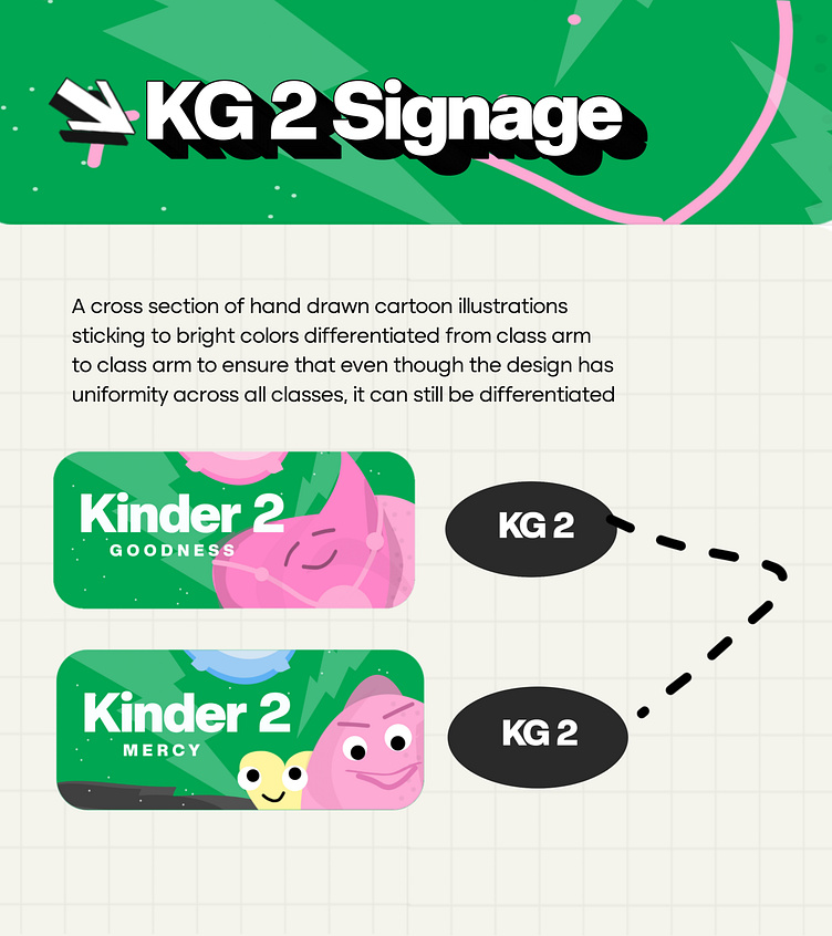
Designing signage for classrooms across different age grades requires a thoughtful approach to ensure clarity, appeal, and appropriateness. Here are some considerations we undertook:
1. Pre-Kindergarten (Pre-K)
Colours:
- Bright, cheerful colors like primary red, yellow, and blue.
- Pastels can also be used, such as light pink, baby blue, and mint green.
Icons:
- Simple, playful icons like teddy bears, building blocks, or animals.
- Educational icons like an apple or a book.
Psychological Impact:
- Bright colors stimulate creativity and engagement.
- Friendly and cute icons create a welcoming and nurturing environment.
2. Kindergarten (K)
Colours
- Vibrant colors such as orange, green, and purple.
- Mix of bright and calming tones to balance energy with focus.
Icons:
- Fun and educational symbols such as crayons, pencils, and friendly characters.
- Nature-related icons like trees, sun, or rainbows.
Psychological Impact:
- Energetic colors promote enthusiasm and exploration.
- Friendly symbols help in building comfort and excitement.
3. Primary Grades (1-3)
**Colours:**
- Bold, primary colors such as blue, red, and yellow.
- Secondary colors like green and orange can also be used.
Icons:
- Educational and engaging icons such as books, stars, or simple geometric shapes.
- Adventure-related icons like maps or magnifying glasses.
Psychological Impact:
- Bold colors stimulate learning and interest.
- Icons that suggest exploration or achievement encourage curiosity.
4. Upper Primary (4-6)
Colours:
- Moderate, vibrant colors like teal, maroon, and dark green.
- Accents of neutral tones like grey or beige for balance.
Icons:
- More mature educational symbols like globes, calculators, or pencils.
- Interest-based icons reflecting their growing hobbies, like sports or music.
Psychological Impact:
- A mix of vibrant and neutral colors provides a balance of energy and focus.
- Icons should reflect their expanding interests and growing intellectual abilities.
5. Junior Secondary School (JSS1-3)
Colours:
- Cool, sophisticated colors such as navy blue, forest green, and burgundy.
- Accents of metallics like silver or gold for a more mature feel.
Icons:
- Academic and professional symbols such as compasses, microscopes, or light bulbs.
- Technology-related icons reflecting their growing tech awareness.
Psychological Impact:
- Sophisticated colors and icons represent maturity and academic focus.
- Encourages a sense of responsibility and intellectual growth.
6. Senior Secondary School (SS1-3)
Colours:
- Subdued, professional colors like charcoal grey, deep blue, and dark green.
- Minimal accents in bold colors like red or gold.
Icons:
- Career-oriented symbols like briefcases, graduation caps, or gears.
- Abstract or geometric icons representing abstract thinking.
Psychological Impact:
- Professional colors and icons signify preparedness for future responsibilities and higher education.
- Reflects seriousness and focus on future goals.