Skyscape IT - New Branding
Originally, Skyscape IT was called “My IT Guy” but in order to attract larger businesses, the client wanted to move away from the one-man-band association the original name was portraying.
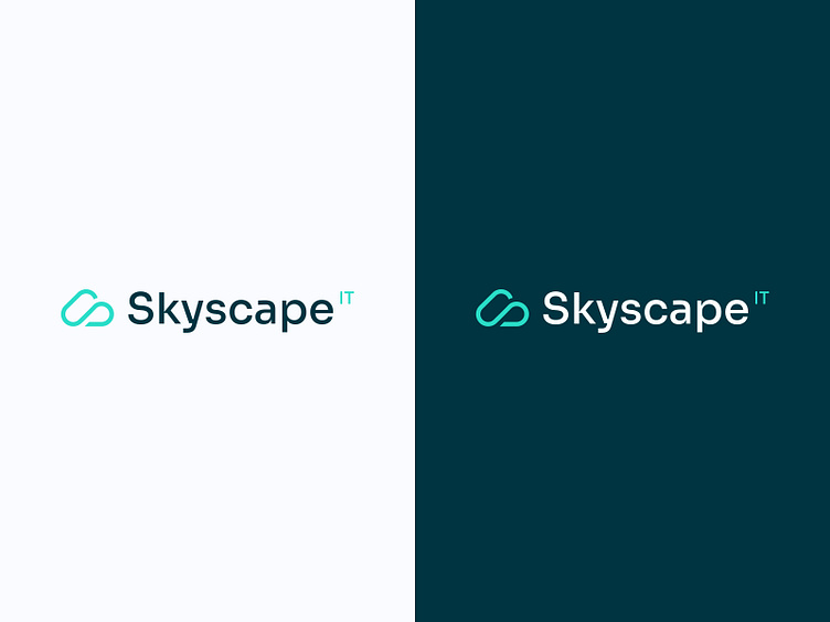
We created a sleek logomark that avoided feeling too corporate as well, but was essentially brand inspired. The logo is now a cloud with the letter ‘S’ for Skyscape IT woven into it.
Before, My IT Guy had a very basic colour palette; blues and whites that resembled Microsoft. Unfortunately, this palette was also shared by many competitors meaning they were being lost in the crowd.
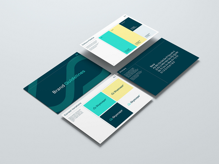
So, we opted for unusual ones. We landed on a palette of deep green, turquoise and a lemony yellow which, unexpectedly, complemented one another excellently. The palette’s greens and blues feel distinctive, and the pops of yellow hone in on that friendly, approachable feel the client was looking for.
When we tested the colour palette from an accessibility standpoint – an important consideration for any website – it scored AAA too, which is an ideal score.
This means that users with disabilities are going to be able to access content against this colour palette too.
Need help with your logo and branding? Get in touch with us.