YOYO BAKERY | LOGO & BRAND
YOYO BAKERY [Logo and Branding Project]
🟢 Logo | Branding | Brand Identity
🟢 Field: Bakery
🎨 YoYo Bakery wants to design a logo: With a donut symbol
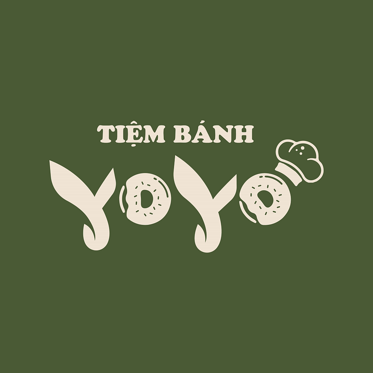
🎨 The logo for YoYo Bakery designed by Kaiza, features a dark green background combined with images of a donut and a chef's hat, creating a standout and memorable brand identity. The green background not only conveys a sense of freshness but also highlights the beige details, making the logo visually appealing and easily recognizable.
A unique touch is the creative transformation of the letter 'O' into a donut and a chef's hat, cleverly and elegantly representing the brand's industry. This design is both professional and approachable, with soft and fluid lines, establishing a strong connection between the brand and its products, making it easy for customers to remember and trust.
Designed by Kaiza
Copyright © Kaiza. All Right Reserved
Contact us:
KAIZA CO.,LTD
• P: 0889 996 399
• E: info@kaiza.vn
• W: www.kaiza.vn
Connect me @ Behance - Instagram - Pinterest


