NASA App Redesign
I wanted to reimagine The NASA App. I broke down a lot of things for why I wanted to do such a thing.
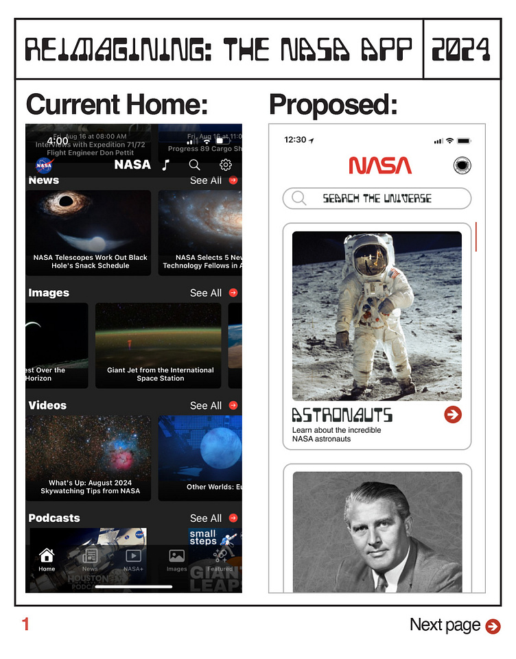
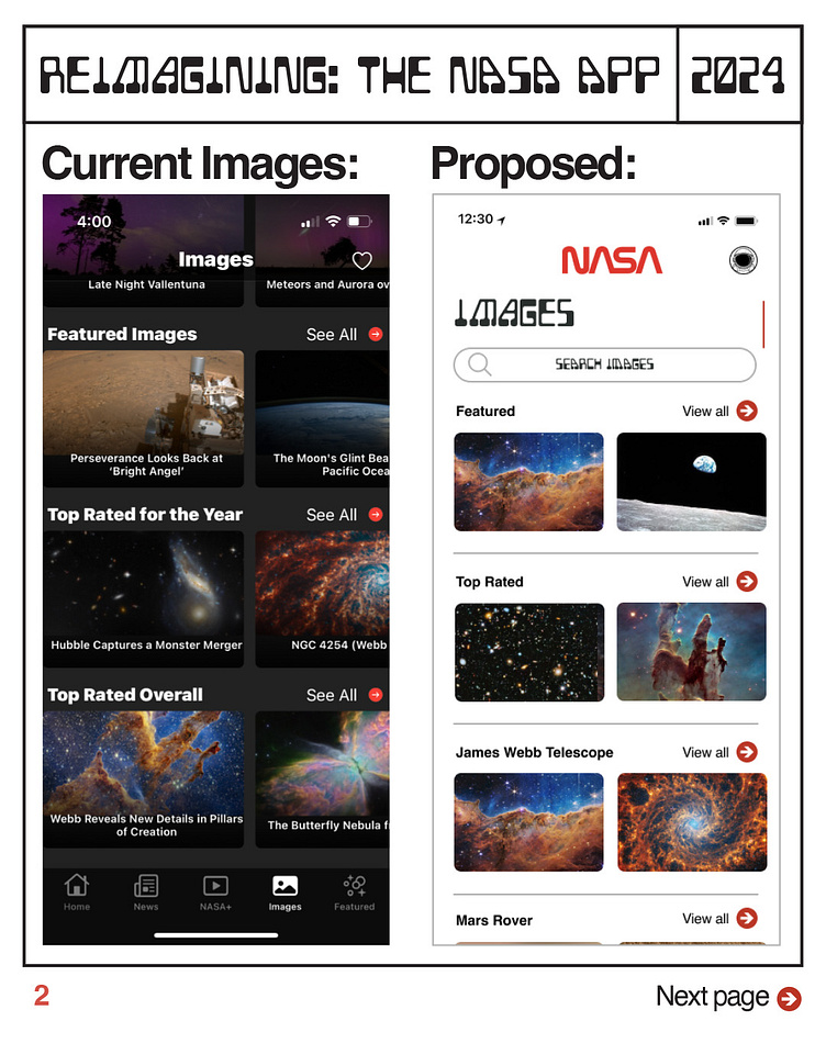
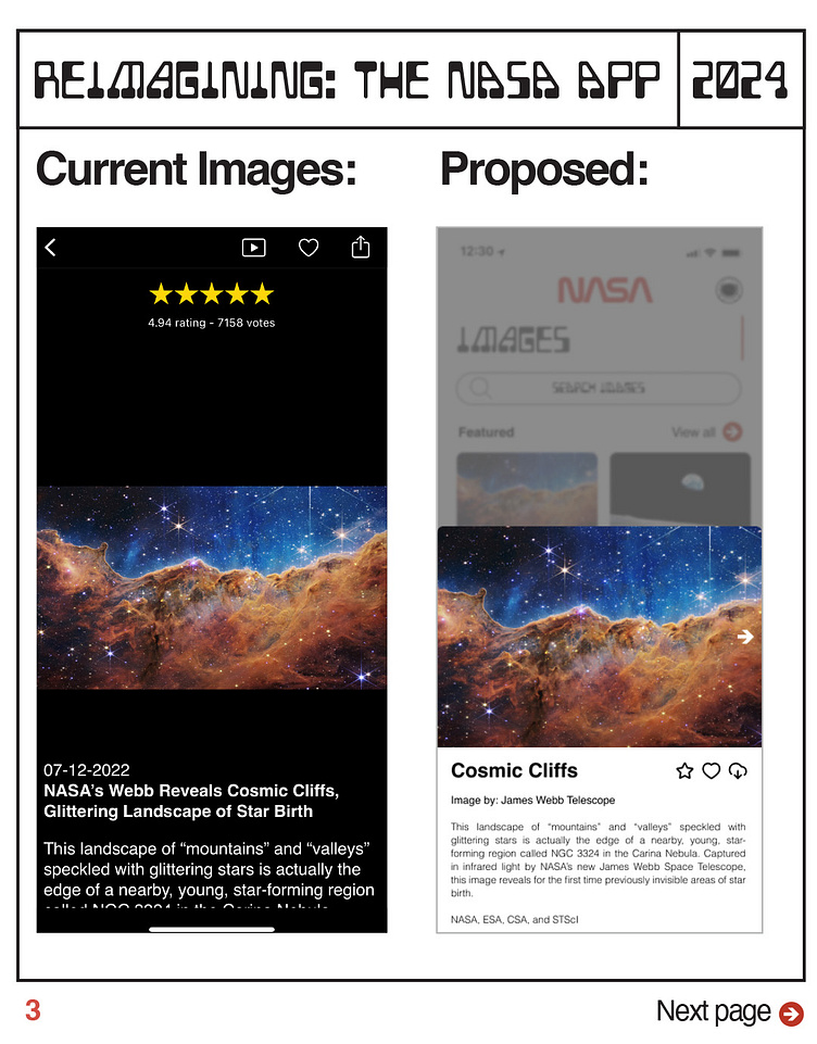
First, some issues I have with the current app:
-Feels a bit cultured
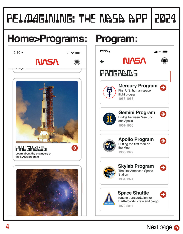
-No real organization in terms of subjects
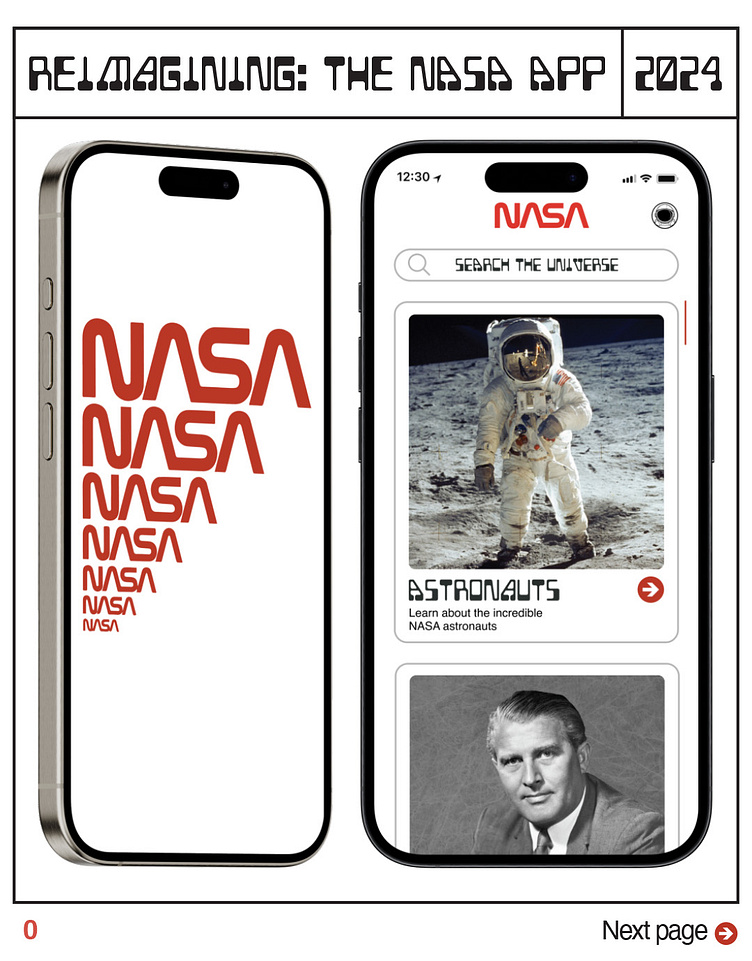
-Search-ability is hit and miss
-Doesn't "feel" like NASA
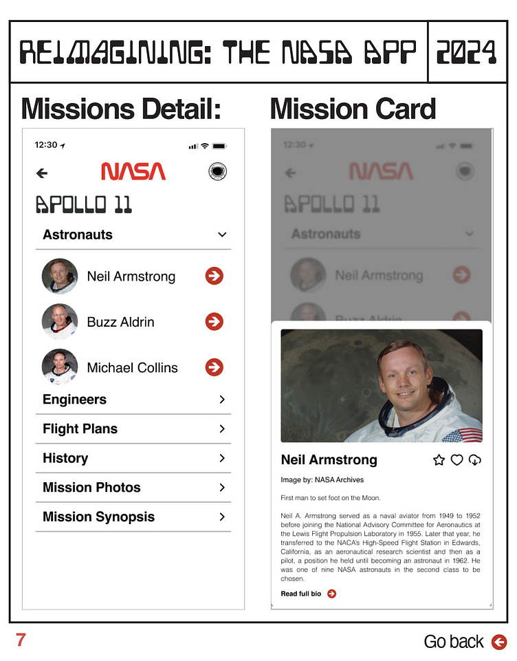
-No ability to feel connected to NASA or really interact
Some thoughts going into redesigning the app:
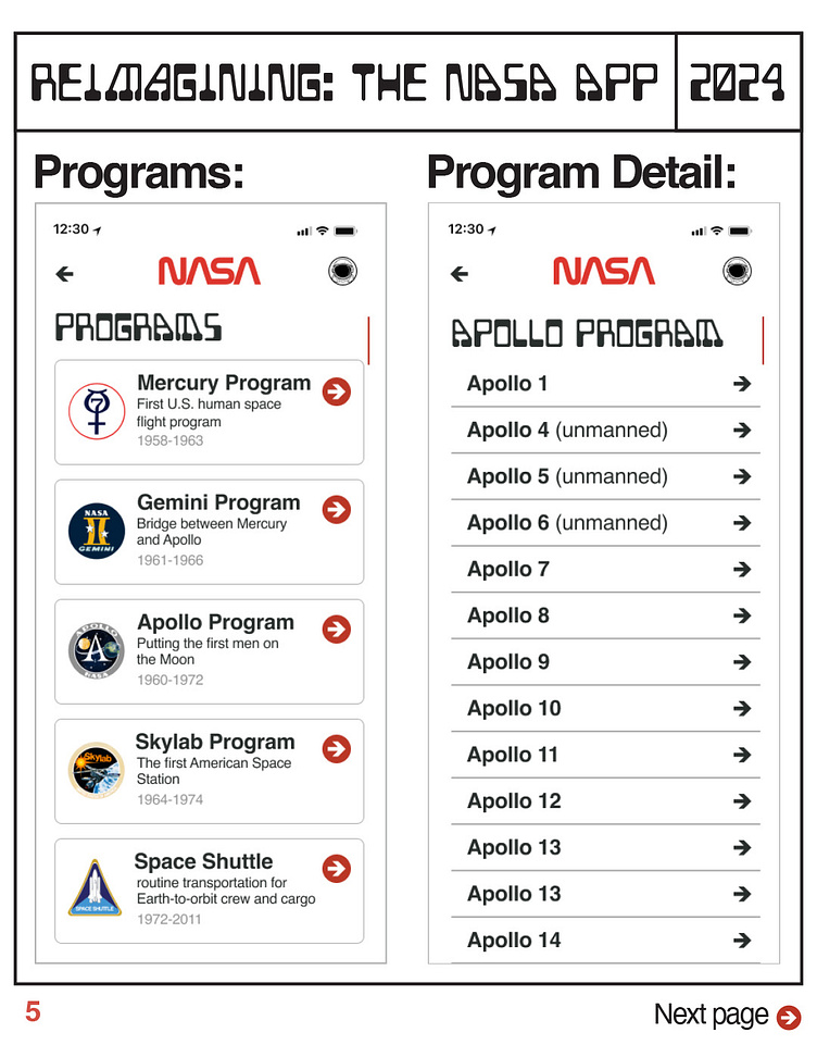
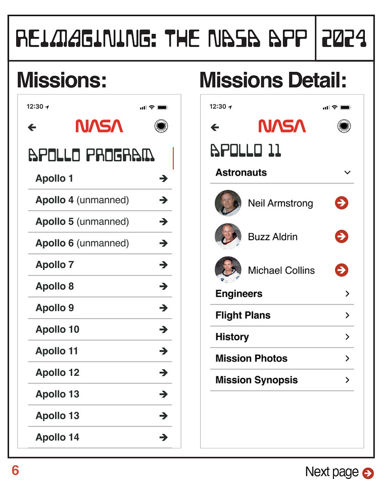
-As I asked people (myself included) of why even use the NASA app, the answer is for knowledge. People want to know about America's space organization, the history, the people, the missions, the universe and more
-The "golden age" of NASA is late 60s with the success of the Apollo 11 mission to probably the 2000s at the height of the Space Shuttle program. 1976 also brought the real look of NASA together with the incredible branding guide.
-How would I like to interact and use the app? What would keep me both engaged and going back?
With all that in mind (I'll do a larger writeup soon), here's a few slides of comparing the current app to my ideas and some other flows. Hope you find it interesting! Note: Still a large work in progress. this is V1 with more things to come!
#UXdesign #productdesign #NASA #NASAapp