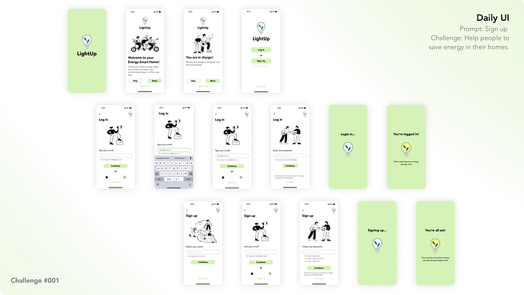
DailyUI: Challenge #001
Project Overview: For the Daily UI Challenge 001, I took on the task of designing a "Sign Up" page, combining it with a Product Design challenge from Drawerrr.com focused on helping people save energy in their homes. The result is an easy-to-use onboarding + signup/log in experience (app) that gets users started on managing their home’s energy use right from the beginning.
Design Process: I followed key UI/UX principles to create a simple and intuitive interface. Accessibility was top of mind, with attention to color contrast, readable fonts, forms well executed with its appropriate helping text, and clear visual hierarchy to make sure everyone can use it comfortably.
Responsiveness: To make sure the design works well on any device, I made the sign-up screens fully responsive. Whether users are on any phone device or tablet, the experience stays smooth and visually consistent across different screen sizes.
UI Kit Development: Alongside the sign-up screens, I created a UI Kit with all the essential elements—color variables, buttons, form fields, icons, and typography styles. This kit will make it easy to expand the app later while keeping everything looking and feeling consistent.
Final Thoughts: This project was all about blending style with function, giving users a simple way to start saving energy at home. I’m excited to keep building on this concept and to see how design can play a role in promoting sustainability.
I hope you enjoyed this little project! If you did, I'd really appreciate a thumbs up or comment. I’d love to hear your thoughts or any suggestions you might have!
And, if you'd like to see more of my work, feel free to visit my portfolio at www.judithmontieldesign.site 🙂
