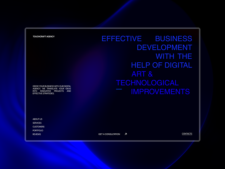
The first screen of the TouchCraft Agency website
About design
..Task
It was necessary to create a website in the company's trademark blue shades using a light gradient. The site should look restrained, concise and necessarily convey the innovativeness of the agency.
..Solution
At the output, we get the following designer solutions:
- The gradient of the agency's brand color was used, which emphasizes their innovativeness.
- In addition, the site looks restrained and there are no exaggerations in the design, which was the task.
My design ❣
If you want to see more of my works, follow the link - https://www.behance.net/5b622cf7
Let's cooperate. I give you my contacts 🤝
Outlook // gogerchak.igor@outlook.com
Email // ihorgog12@gmail.com
Telegram // - Ihor Hoherchak
Instagram - https://instagram.com/ihor.design?igshid=YTQwZjQ0NmI0OA==
WhatsApp // Ihor Hoherchak