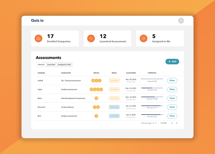
Quiz Management Dashboard
Quiz Management Dashboard
The Quiz Management Dashboard is a tailored tool for administrators managing digital assessments provided to companies that want to evaluate their knowledge in specific technology skills. It was designed to offer deep insights into current assessment status, assessment history and metadata. The focus was on creating a user-friendly and data-rich interface that helps decision-makers with the overall management process.
Problem Statement
As the company is on track to launch a new quiz service to it's clients, they needed an admin side to manage current and past assessments taken in the platform. The objective was to design a dashboard that simplifies the process of viewing and analyzing digital quiz history and metadata, designed from the ground up.
Design Process
User Research: Conducted research with target users—administrators responsible for managing digital assessments—to identify their specific needs and challenges. Key insights revealed a demand for quick access to actively changing assessments and comprehensive progress metrics.
Lo-fi Wireframing: Created low-fidelity wireframes to establish the basic layout and flow of the dashboard. These wireframes were tested with users to gather feedback on the placement of key elements and the overall usability.
Hi-fi Wireframing: Refined the wireframes into high-fidelity versions, incorporating user feedback and enhancing visual clarity. This stage focused on fine-tuning the design to ensure it met all user requirements while maintaining a clean and modern look.
Final Mockups: The final mockups were developed with improved typography, a cohesive color palette, and added features like interactive tables and charts. These mockups provided a polished and professional interface, ready for implementation.
Low-fi Wireframes
Hi-fidelity Wireframes
With these wireframes came many questions, such as what assessments states should we cover? should the information displayed change based on the status? What should be the focus point for admins getting to this screen? among others.
Challenges and Solutions
Optimizing Data Structure for User Efficiency
Challenge: "The original data structure required users to first select the company and then the assessment, leading to unnecessary clicks, especially when most companies had only one assessment."
Solution: Re-thought the data structure by making the company a property of the assessments, instead of the assessments being part of a company. This change allowed admins to see all active assessments in a single table, reducing clicks and enabling direct access to the assessment page with one click. This adjustment streamlined the workflow and enhanced user efficiency.
Balancing Aesthetics with Functionality
Challenge: "The interface must be visually appealing while ensuring all critical information is accessible."
Solution: Designed a clean theme and a consistent color scheme matching the brand colors to create a visually appealing yet functional interface. The design emphasized readability and accessibility, ensuring that aesthetics did not compromise the dashboard’s usability.
Outcome
The final design successfully addressed the challenges faced by administrators managing digital assessments. The dashboard’s intuitive layout and comprehensive data views significantly improved the efficiency of the assessment management process. The mockups were implemented and have continued to receive positive feedback from users.


