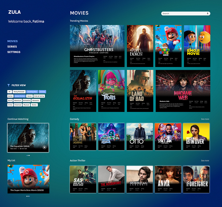
Daily UI Challenge #025 - TV App
Hello, peeps. 🙋♀️ Here's my entry for day 25.
For this challenge, I focused on the browsing experience of the TV app. The filter is placed in the left panel so users can always control how many titles are shown on the home screen. The layout also adjusts according to the number of categories selected to optimize the browsing experience.
Having options is good, but when there are too many...hesitation arises and decision-making becomes harder. That's why I think more control over view = less decision-making + more time to enjoy movies and shows. Agree? 🙂
Daily UI Challenge 025/100
More by Bianca Chang View profile
Like
