Financial Solutions for Self-Employed - UI/UX Redesign
Client:
Collective, a platform dedicated to providing all-in-one financial solutions for self-employed entrepreneurs. Their services help streamline business formation, bookkeeping, compliance, and tax-related tasks.
Objective:
The main objective of this redesign was to enhance the overall user experience by simplifying the interface, making critical information more accessible, and ultimately improving conversion rates. The client needed a modern, clean, and professional look that reflects their brand values while making the platform more intuitive for users.
Challenges:
Clarity in Communication: Collective's offerings are multifaceted, which required a design that effectively communicates the value proposition without overwhelming the user.
User Engagement: The previous design needed more engagement touchpoints and a stronger visual hierarchy to guide users through the platform effortlessly.
Conversion Optimization: The CTA buttons and conversion funnels needed to be more prominently displayed to improve user sign-ups and interaction.
Design Solutions:
1. Visual Refresh
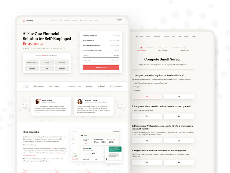
I introduced a clean and modern design language that aligns with Collective's brand identity. The use of soft tones combined with red accents helps guide users' attention to key areas, especially the CTAs.
Typography was carefully selected to balance professionalism and approachability, ensuring the content is easy to read while maintaining a premium feel.
2. Content Organization
The content structure was refined to emphasize the key benefits of Collective's services. On the homepage, a step-by-step explanation of the services provided was introduced to ensure that users understand the value Collective brings.
Pricing pages were designed to clearly outline the differences between subscription options, helping users make informed decisions quickly.
3. Improved User Flow:
The content structure was refined to emphasize the key benefits of Collective's services. On the homepage, a step-by-step explanation of the services provided was introduced to ensure that users understand the value Collective brings.
The redesigned forms were optimized for a smoother experience, with clear progress indicators and concise questions.
4. Improved User Flow:
The content structure was refined to emphasize the key benefits of Collective's services. On the homepage, a step-by-step explanation of the services provided was introduced to ensure that users understand the value Collective brings.
The redesigned forms were optimized for a smoother experience, with clear progress indicators and concise questions.
5. Conversion-Oriented Design:
CTA buttons were made more prominent with high-contrast colors and strategic placement throughout the site to capture users' attention at key decision points.
Testimonials and trust badges were strategically placed to build credibility and encourage conversions.
Results:
The redesign is expected to result in higher engagement, improved user satisfaction, and better conversion rates. By streamlining the information architecture and enhancing the visual design, Collective can now deliver a more polished and professional experience that appeals to its target audience of self-employed entrepreneurs.
Testimonials and trust badges were strategically placed to build credibility and encourage conversions.
Conclusion:
This project was a fantastic opportunity to apply my UI/UX skills to a platform that offers crucial services to self-employed individuals. The new design not only looks modern and clean but also provides a more intuitive user experience that supports the client’s business goals.


