Real Estate Website Design
💌 Got a website idea? Let’s bring it to life together!
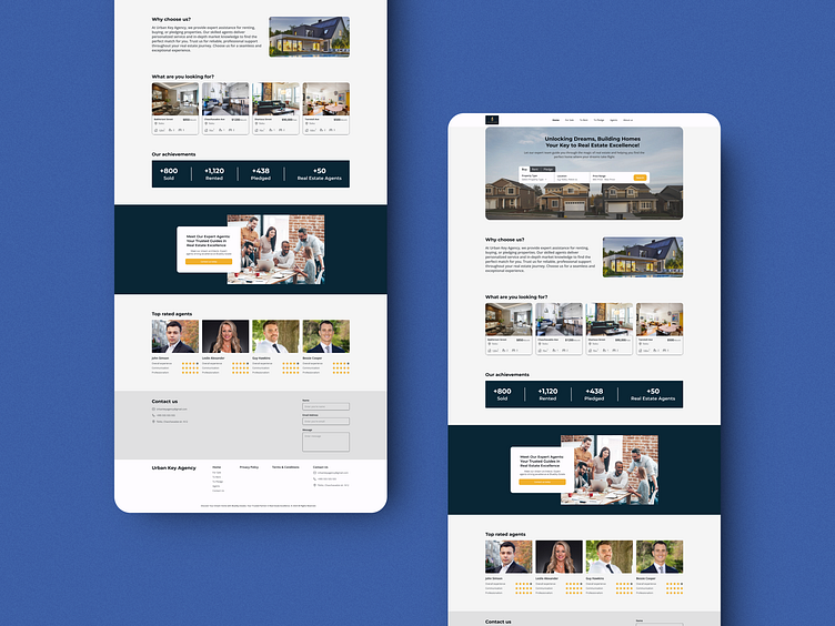
Hi guys! I'm sharing my first work, about real estate website. The homepage encourages users to easily search for properties, explore company information, or request a callback to connect with an agent.
🌟 We’ve designed this space to make your property search intuitive and stress-free. Filter available properties by square meters, price, floors, bedrooms, and condition to zero in on your ideal home. Whether you're after a modern apartment or a family-friendly house, our streamlined search and filtering options help you find exactly what you’re looking for. Start your journey to a new home with us! 🏡✨ here...
🎨 Color Palette Explanation 🌟
For our real estate website, we carefully selected a color palette that embodies both elegance and functionality:
Soft White: This light, almost pure white hue creates a clean and sophisticated backdrop, allowing content to shine while providing a sense of spaciousness and clarity. It helps to highlight property images and important information, making the user experience smooth and visually appealing.
Golden Yellow: This vibrant golden yellow adds a touch of warmth and energy, evoking feelings of optimism and success. It’s used to draw attention to key elements like buttons, calls to action, and highlights, guiding users effortlessly through their property search journey.
Deep Charcoal: This dark, grounding shade of charcoal offers a striking contrast against the lighter tones, enhancing readability and giving the site a modern, upscale feel. It reinforces the website’s professional and trustworthy character, essential in the real estate industry.
Together, these colors create a balanced and inviting user experience, perfectly aligned with the values of our real estate brand. 🏡✨


