Mesa Visual Motif
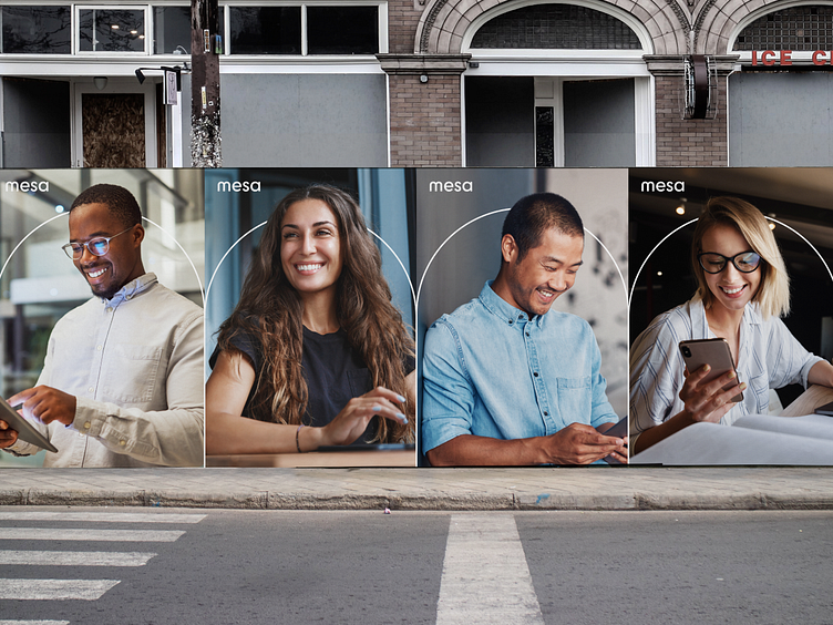
Central to Mesa's brand strategy was the concept of a bridge. Mesa platform allows users to accelerate payments on invoices closing payment gaps. This was executed visually with a custom logotype with the 'm' in Mesa acting as a visual representation of a bridge. The simple outline of the 'm's counter shape was then used as part of the brand's visual language. Its used here to visually and metaphorically link people together.
✌️ Have a project you'd like to chat about? Hit us up at heyo.is/excited-to-chat