App design
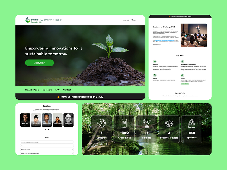
The Environmental Care App features a clean and intuitive design that prioritizes user experience while fostering a connection to nature. The color palette predominantly consists of vibrant shades of green, symbolizing sustainability, growth, and a commitment to the environment. This choice of color not only creates a calming aesthetic but also reinforces the app's mission of promoting ecological awareness and care.The app's interface is sleek and minimalistic, allowing users to easily navigate through various features and resources. High-quality real images of nature, wildlife, and conservation efforts are integrated throughout the app, providing a realistic and inspiring visual context. These images enhance user engagement and evoke a sense of responsibility towards environmental stewardship.
