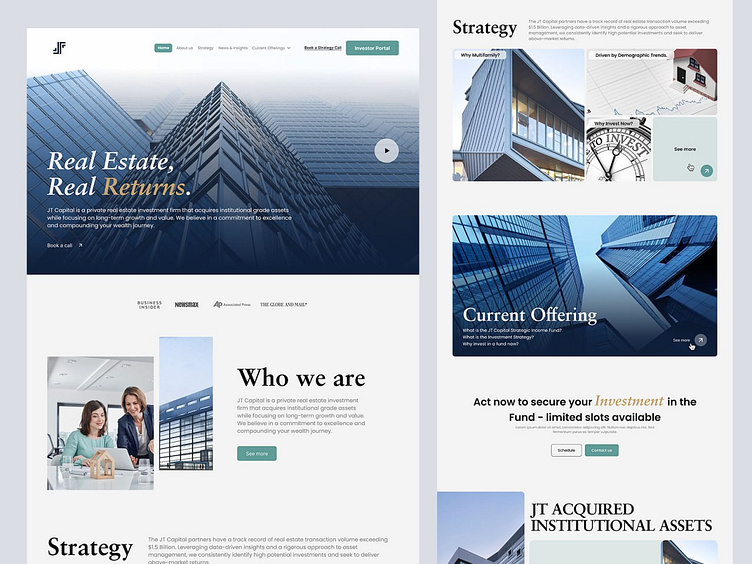
Real Estate Website Landing Page UI Design
Section Preview ✨
Mockup Preview ✨
Mockup Preview ✨
Full Preview👀
"Real Estate Website Landing Page UI Design"
We have recently designed a modern and dynamic website for a real estate company. The website features smooth animations, a clean layout, bold branding colours, relevant imagery, and an easy-to-navigate interface. We included sections for information about our company, our strategy, JT Acquired Institutional Assets, news, and insights. Additionally, we added an "about us" section. This project highlights our expertise in creating visually appealing, contemporary websites for real estate under the JT Capital brand.
Hope you like it, Feel free to give feedback, and don't forget to press "L" or the love button if you like it.... 😊
Visit our website to see more!
Say hi.?
Drop us a few lines at hello@olack.agency
Get in touch
WhatsApp | Telegram | Skype | Cup of coffee with Olack
Stay tuned for our updates at


