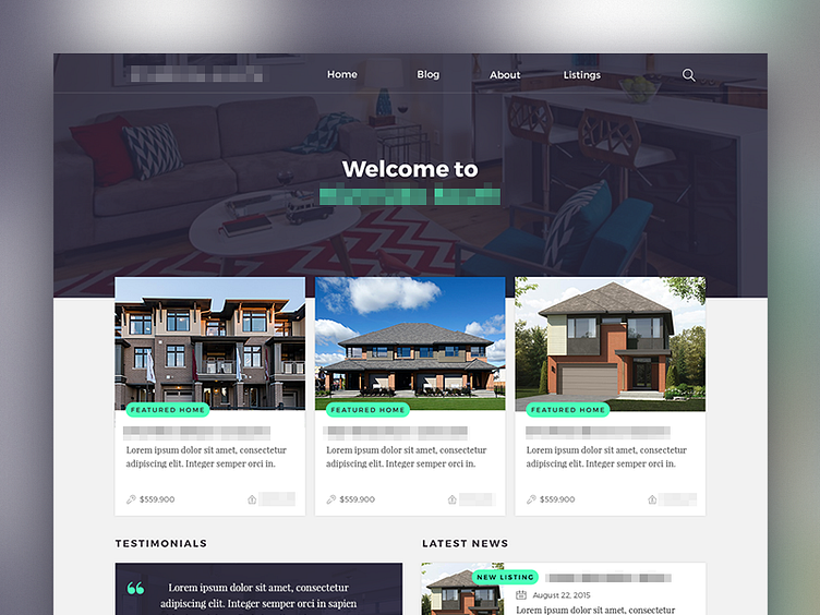
WIP Real Estate Website
WIP website for a real estate website.
Not sure about the color palette yet, but I really do like that screaming turquoise.
Even less sure about the Latest News Card with the heading being offset by the tag.
I'm definitely missing some call to actions, but I don't think screaming turquoise would be the way to go for those. Maybe red?
More by Paul Morel View profile
Like
