Keepers Harvest Visual Identity

My clients were aiming for a fresh perspective within the honey/bee industry, so we brainstormed ways to make them stand out while reflecting their commitment to the local community. Inspired by the vibrant character of Austin, Texas, we developed colors, typography, and symbols to reflect the city’s spirit, while the bee’s head and body were modeled after its iconic skyline features. The color palette is vibrant and inviting, with honey yellow paying homage to bees and greens signaling their dedication to sustainability. To ensure the brand’s adaptability and visibility to attract new customers and opportunities, I created a variety of badges, logotypes, and symbols for a unified and dynamic logo suite.

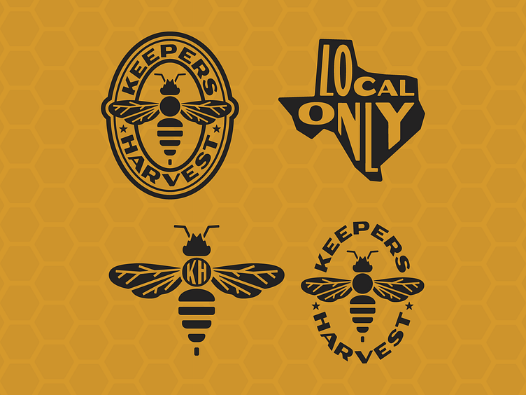
The Bee Mark
The bee logo, inspired by Austin’s skyline, symbolizes Keepers’ commitment to local values and a community-centric approach.

The Wordmarks
From custom scriptmarks to brand marks, this project had it all. This color palette breaks away from traditional honey branding, aligning perfectly with the mission of promoting sustainability.