Aegise™ - Logo & Branding for Safe House Constrution Company
I recently finished a logo and brand identity design for Aegise™, a company that builds safe houses. Working closely with the client was key to this project. They shared their ideas and guided me throughout the process. Their feedback was very helpful in creating a design that matched their vision. The final result was a strong and unified brand identity. The client was very happy with the outcome and appreciated how well the design represented their company.
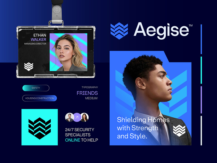
Concept: Shield + Building + Upper Arrows
Color Psychology: Blue symbolizes trust and reliability, ideal for construction, while purple adds a touch of creativity and safety. Together, they suggest a company that builds secure, innovative homes.
Press "L" to show your love ❤️️
______________________________________________________________________________________________
👉 Say goodbye to ineffective logos and hello to a design that’s both memorable and recognizable!🌟
📩 Available for new projects :
Email: info@rahidrehman.me
WhatsApp: https://wa.me/+8801705553455
Telegram: @rahiddesigner
💡 Follow for more update: Dribbble, Behance, Instagram, Twitter, Linkedin
© Rahid Rehman