(🛳️ Redesign 2/4) Search animations to streamline user results
🚢 Update 1: Bringing a cruise page's search to life
Est read time: 1 minute
Project start & overview: https://shorturl.at/lvhm9
After creating a taxonomy of popular search destinations and designing a home page search hierarchy, I wanted to make a prototype of the search animations I had envisioned.
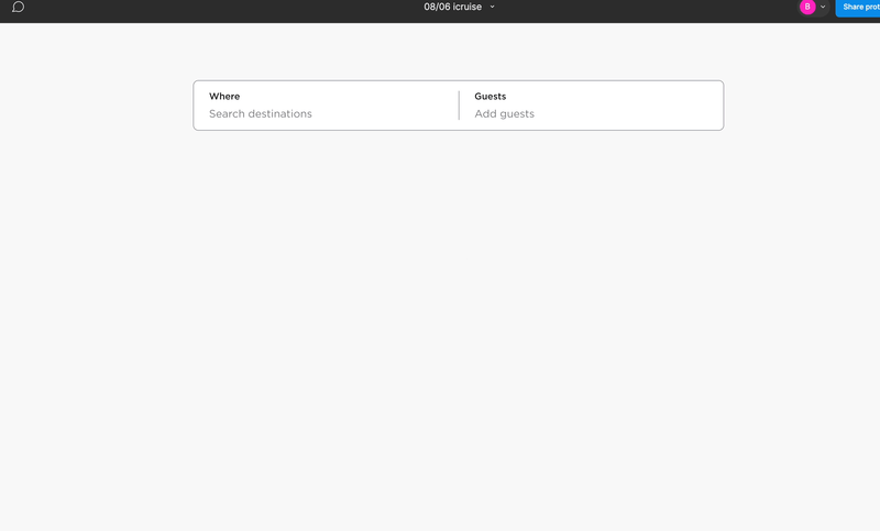
Trickier than anticipated, this prototype features 3 animated component sets nested within this 1st section:
A blinking cursor input animation for the 'where' section
The moving rectangle on the parent tabbed section (Where/Guests) with a time-delayed expansion of the larger box that houses the child search criteria
The secondary animated search tabs (destinations/region/river/cruise) for the different ways a user could browse destinations/cruise types
The intention behind using 'Where' and 'Guests' as the primary search criteria was based on research that helped me understand the different user groups who book cruises. Solo travelers, couples, families with children, and senior travelers each have different priorities when it comes to booking a vacation, so being able to use this information to provide better, more relevant search results, would result in a better experience for visitors (and hopefully result in more bookings for the businesses involved).
This prototype was quite the brain twister, pushing my understanding of Figma animations to another level...as well as the level of personal satisfaction when I successfully executed the design!
🔜 Next up is designing a search results page, where I'm looking forward to integrating some of my favorite e-commerce filter design patterns that help users quickly find their perfect cruise out of over 50,000 options.
