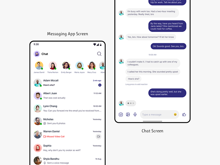
Messaging App Screen
Here's a chat screen design for a messaging app, where I've addressed some potential edge cases users might encounter. As a designer, handling edge cases is key to creating a usable product. I'd love to hear your feedback on how to improve the design and suggestions for additional edge cases I may have missed. :)
The icons I've used are from the 'Hicon' Icon Pack by figma.com/@HadiSharifani. All avatars are from the '150+ Pro Avatars Pack,' both from the Figma Community.
More by Oshin Dali View profile
Like


