Nike's Air Jordan 1 Retro High Re-Design Product Page
Introduction
Company Overview: Nike, a global leader in athletic footwear and apparel, is known for its innovative designs and strong brand identity. The Air Jordan series, in particular, is one of Nike's most iconic and sought-after product lines.
Project Overview: This case study focuses on the user interface (UI) and user experience (UX) design of the product page for the Air Jordan 1 Retro High OG. The analysis will cover the visual design, functionality, and overall user journey, with the aim of understanding how effectively the design facilitates the purchasing process.
Design Analysis
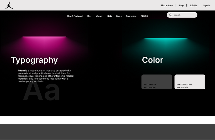
Color Scheme: The webpage uses a neutral color palette with shades of grey, black, and white, which helps the product images stand out. The use of red for the "Air Jordan 1 Retro High OG" text adds a pop of color that aligns with the brand's identity.
Typography: The typography is clean and modern, using sans-serif fonts that are easy to read. The hierarchy of text is well-established, with the product name and price being the most prominent.
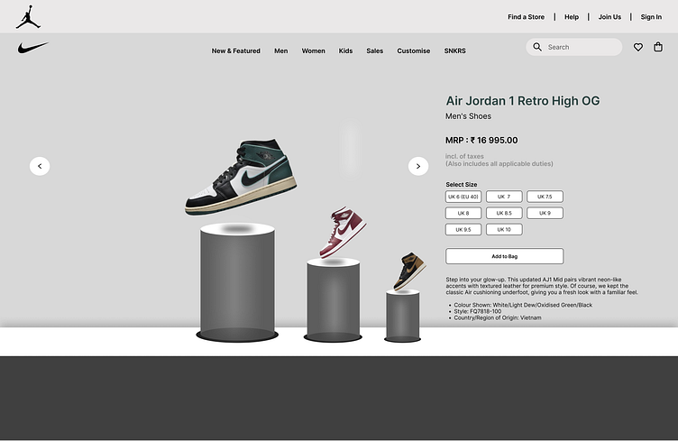
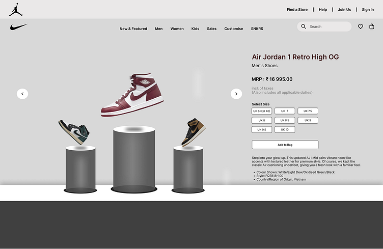
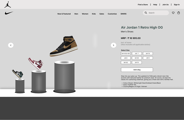
Imagery: High-quality images of the shoes are prominently displayed, utilizing a 3D effect that gives a sense of depth and realism. This visual approach highlights the product's design and craftsmanship, appealing to the target audience's desire for exclusivity.
We are available for new projects
Feel free to reach out to me if you want to create or revamp your website at
📧 Email: Mohammedahedsiddique@gmail.com
📞 Skype: Message us
💬 Whatsapp: Message us
💬 Fiverr: Message us
Enter your text here...
