Landing Page Redesign for AI Company
Project Overview:
I had the opportunity to redesign the landing page for Sift, a leading company in AI-powered fraud prevention solutions. The main goal of this project was to create a more engaging, modern, and conversion-focused landing page that resonates with the target audience and clearly communicates the product's value.
Challenge:
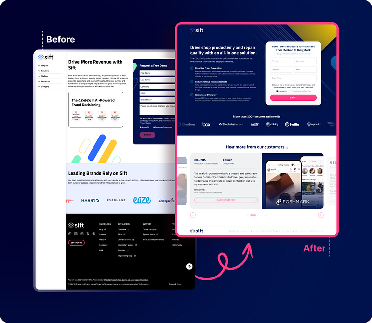
The previous design had a more traditional and somewhat outdated layout + color scheme, with large text blocks and a heavy reliance on white space. It lacked the visual hierarchy and user engagement needed to quickly capture the visitor's attention and guide them towards the primary call-to-action (CTA).
Objectives:
Modernize the look and feel of the landing page while keeping it aligned with Sift’s brand identity.
Improve the overall user experience by making the content more digestible and the navigation more intuitive.
Increase conversion rates by emphasizing key selling points and optimizing the CTA. And also make the form appear visually shorter by re-designing it.
Solution:
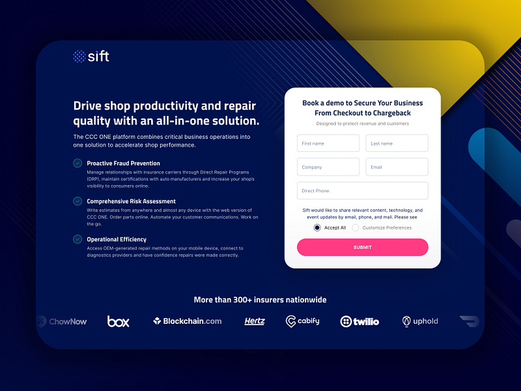
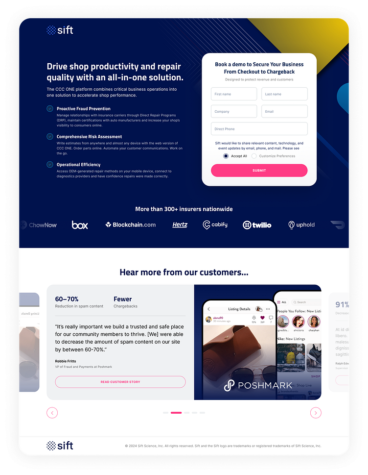
Visual Design Refresh: I improved upon the modern color scheme that client already had, replacing the predominantly white background with a deep blue, which not only creates a more professional look but also allows key elements to stand out. The use of geometric patterns and gradients adds depth and visual interest, drawing the user's eye toward the form, which is the main focus of the landing page.
Content Reorganization: The content was restructured to highlight Sift’s core offerings in a clear and concise manner. Key benefits, such as Proactive Fraud Prevention and Comprehensive Risk Assessment, are now presented in a digestible format, with bullet points and icons that make scanning easier for users. Those points were not there before, and it is important to have enough information on "Get a Demo" page in order for user to make the right decision about the service.
Improved CTA Placement: The primary CTA "Book a demo" was made more prominent with a contrasting pink button, which stands out against the dark background. The form was simplified to reduce friction and encourage sign-ups.
Customer Testimonials and Trust Signals: I incorporated a section featuring testimonials and logos of well-known brands using Sift’s services, which serves to build trust and credibility with potential customers. This social proof is very important for any decision-level pages
Outcome:
The redesigned landing page not only provides a more engaging and visually appealing experience but also effectively communicates Sift's unique value propositions. The enhanced user interface is expected to lead to higher conversion rates by guiding users smoothly through the decision-making process.
Conclusion:
This project allowed me to apply my UI/UX skills to create a landing page that not only looks great but also performs better in terms of user engagement and conversions. I’m excited to see the impact of these changes and look forward to continuing to refine and optimize the design based on user feedback.
