Vaceego Mobile App - Search and Plan CE Courses
App Description
This application helps dental professionals to easily search, register, and track Continuing Education (CE) courses they can attend while on vacation.
They looking for a orange color scheme, avoiding bold and bright colors. Not to many different colors. Use colors that contrast cards with backgrounds. Partial to rounded corneres on buttons and cards vs sharp edges.
Execution
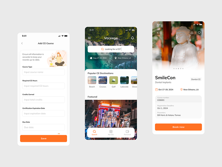
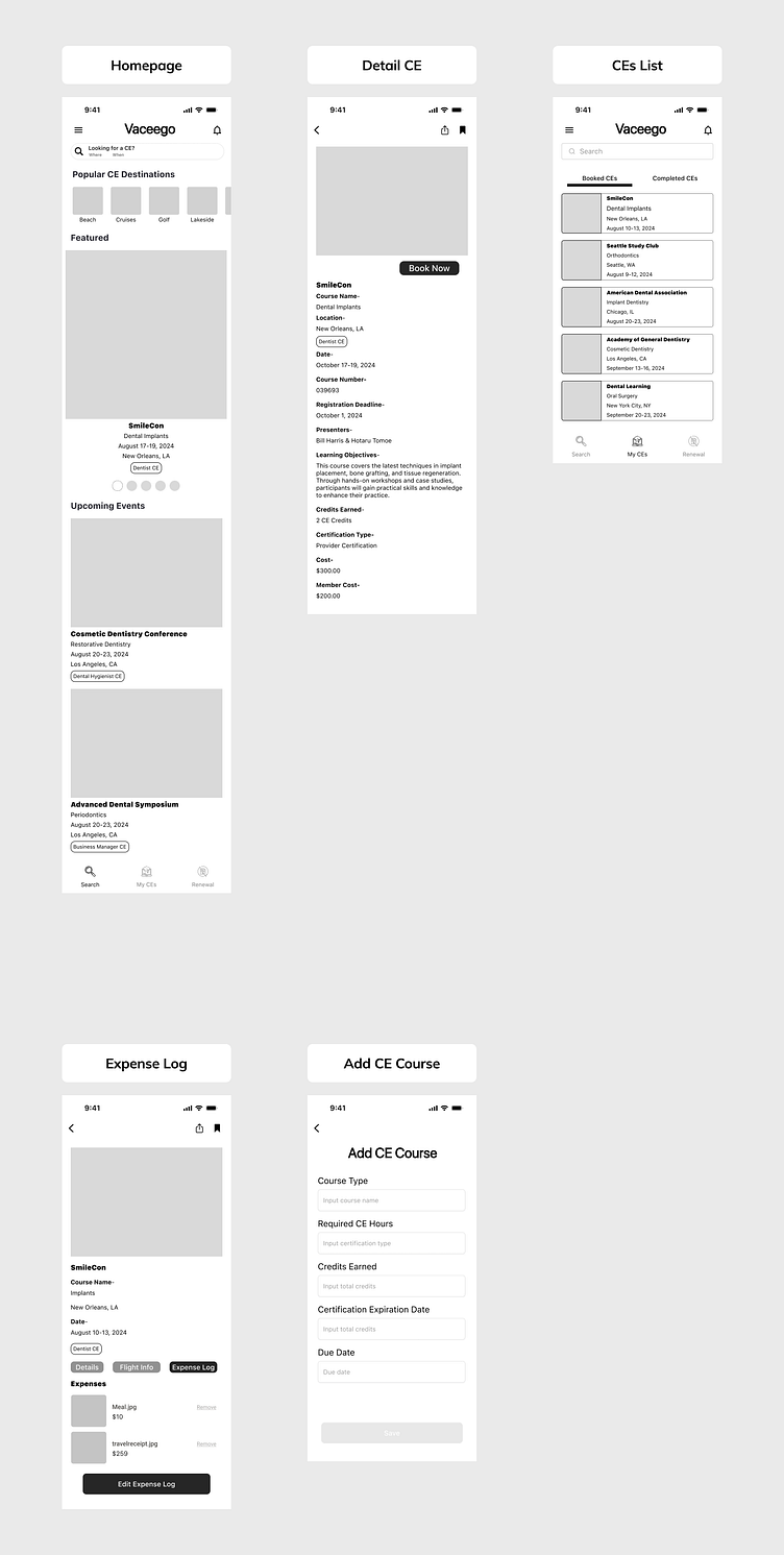
I worked closely with the client to refine and define their layout preferences. I started with a final lo-fi design and transitioned to high-fidelity mockups, emphasizing interaction and UX usability improvements. My design includes five key screens:
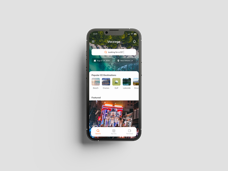
Homepage - A dynamic landing page that sets the tone with a clean, engaging layout.
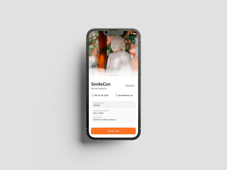
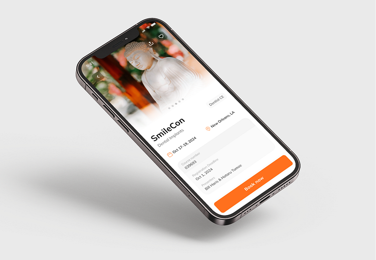
Detail CE - A detailed view of Continuing Education courses, optimized for clarity and user interaction.
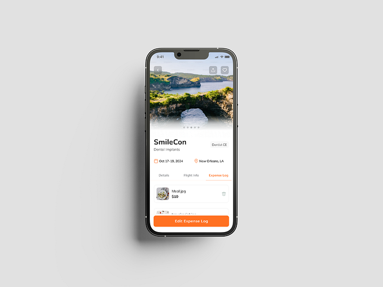
Expense Log - A streamlined interface for tracking expenses, ensuring ease of use and accessibility.
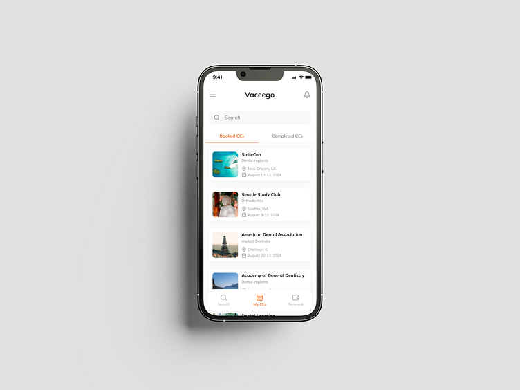
CEs List - An organized listing of Continuing Education courses, designed for efficient navigation.
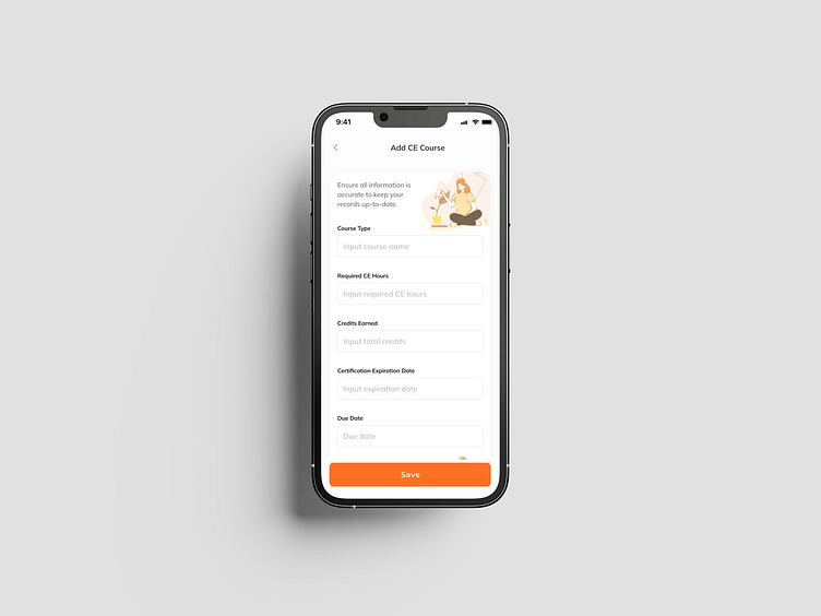
Add CE Course - A user-friendly form for adding new courses, featuring intuitive input fields and guidance.
The challenge was to ensure that the transition from lo-fi to hi-fi not only preserved the core functionality but also enhanced the overall user experience through thoughtful interaction design and usability improvements.
Interested to collaborate?
DM me on dribbble or email: gitetuko@gmail.com
