Dashboard Design
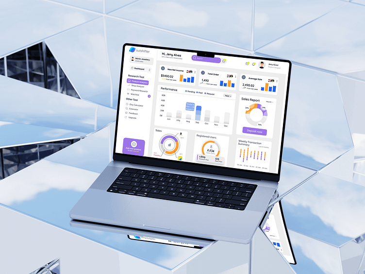
Here's a sneak peek of the latest dashboard design I crafted for Outshifter, an innovative platform for e-commerce management. 🎨✨
🔍 Overview: The dashboard provides a comprehensive overview of key metrics and tools, including performance analytics, sales reports, registered users, and weekly transaction summaries—all at a glance. With a focus on a clean, modern interface, the design ensures that users can easily navigate and interact with their data.
🎯 Key Features:
Product Analytics: Track and analyze product performance with ease.
Sales Report: Visualize sales trends and monitor average sales metrics.
Research Tools: Integrated tools like shop analyzer, keyword research, and more for enhanced decision-making.
User-Friendly Navigation: Clear, intuitive menus and icons to streamline user experience.
💡 Design Approach: I aimed for a balance between functionality and aesthetics, using a palette of soft purples and neutrals to create a professional yet engaging feel. The use of charts and graphs adds visual interest while making complex data easy to understand.
Tools Used:
Figma
Canva
Photopea

