Brand & Visual Identity - Gaius Studio
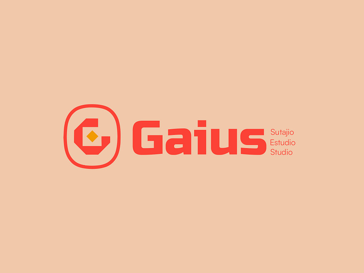
Ladies and gents, feast your eyes on the official logo for Gaius Studio, where creativity meets efficiency—because let’s be real, it’s a one-man show here!
Presenting the visual identity that says, "I'm a solo artist, but I bring the fire of an entire creative agency." The logo masterfully combines bold geometry with a warm, inviting palette. Notice the dynamic ‘G’ encapsulated within a rounded square—yeah, that’s no accident.
It’s a perfect blend of sharp creativity and soft approach ability, much like the one-man band behind Gaius Studio.
And that little orange diamond in the middle? It’s not just a pretty shape; it’s a symbol of the precision and focus that goes into every project, even when there’s no one around to pass the coffee.
Let’s talk about the typeface—strong, modern, and just the right amount of chunky, like a dependable friend who also knows how to party. The name "Gaius" stands out boldly, while the words "Sutajio," "Estudio," and "Studio" elegantly trail off, hinting at the global versatility of this creative wizard.
So, if you’re looking for a designer who can do it all—literally—this logo is your sign. No team? No problem! Gaius Studio has got you covered with the power of one and the quality of many.
What do you think? Does this logo scream “I got this” or what? Drop a comment, and let’s chat!


