Juice Bar Logo - SCOOP
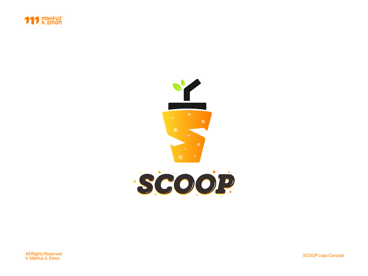
Brand Name: SCOOP
Description: It's mainly a juice bar which also serves fast food items.
Concept: I designed the logo by transforming the letter 'S'—the brand’s initial—into a juice cup, symbolizing a vibrant juice bar experience. The addition of two green leaves sprouting from the straw emphasizes freshness and natural quality, aligning with a modern, clean aesthetic. This logo concept integrates a minimalistic approach, ensuring a strong visual identity that resonates with organic, healthy living.
N.B.: It's a work on progress project. Full branding coming soon.
Let's work together.
To connect:
Facebook Instagram X Behance Linked In Reddit Pinterest
WhatsApp: +8801736552963
