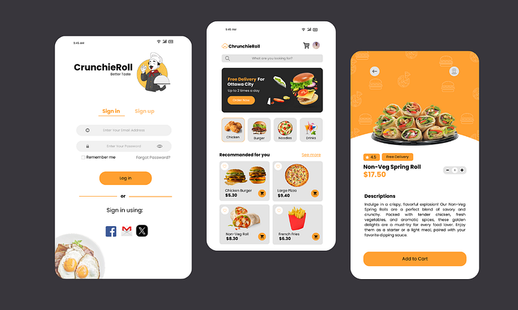
CrunchieRoll - Food Mobile UI Design
CrunchieRoll: A Case Study in Food Mobile UI Design
The Challenge
CrunchieRoll, a burgeoning food delivery service, sought to enhance its mobile app user experience to boost customer satisfaction and drive order volume. The existing app was cluttered, slow, and lacked intuitive navigation. The goal was to create a clean, modern interface that streamlined the food ordering process while showcasing the brand's vibrant personality.
Design Process
1. User Research and Analysis:
• Conducted in-depth user interviews to understand customer pain points, preferences, and behaviors.
• Analyzed competitor apps to identify industry best practices and potential opportunities for differentiation.
2. Information Architecture:
• Created a clear and logical information hierarchy to organize food categories, menus, and checkout process.
• Developed user flow diagrams to visualize the customer journey and identify potential friction points.
3. Visual Design:
• Established a brand identity that aligned with CrunchieRoll's target audience and values.
• Created a visually appealing color palette and typography system that reflected the brand's energetic and appetizing nature.
• Designed custom icons and illustrations that were both visually appealing and informative.
4. Interaction Design:
• Implemented intuitive gestures and animations to enhance user engagement.
• Prioritized speed and responsiveness for a seamless user experience.
• Optimized the checkout process for quick and easy order completion.
Key Design Features
• Clean and Intuitive Interface: A minimalist design with clear typography and ample white space creates a visually appealing and easy-to-navigate experience.
• Vibrant Imagery: High-quality food photography highlights the deliciousness of the menu items.
Personalized Recommendations: Utilizes user data to suggest personalized food choices.
• Efficient Search Functionality: Allows users to quickly find their desired food items.
• Smooth Checkout Process: Streamlined checkout flow with multiple payment options and order tracking.
• Loyalty Program Integration: Rewards repeat customers with exclusive offers and discounts.
Results
The redesigned CrunchieRoll app has been met with overwhelmingly positive feedback from users. Key performance indicators (KPIs) have shown significant improvement, including:
Increased user engagement and session duration
Higher conversion rates and average order value
Improved customer satisfaction ratings
Reduced customer support inquiries
By focusing on user-centric design and a deep understanding of the target audience, CrunchieRoll has successfully transformed its mobile app into a powerful tool for driving business growth.
_________________________________________________________
Recently I was worked on a FOOD DELIVERY APP project. I have share here some part of that project. I will showcase the full project gradually.
Hope all of you guys love it. ❤️
==========
I am available for new projects.
Just drop us a line at email: ytravi431@gmail.com
I am always available for a quick chat over...
==========
I will provide a quick analysis and a free proposal for it. Don’t worry, it is secure and confidential.
Thanks.....!

